Chart position — tracked daily by LaunchShots
Screenshot style breakdown
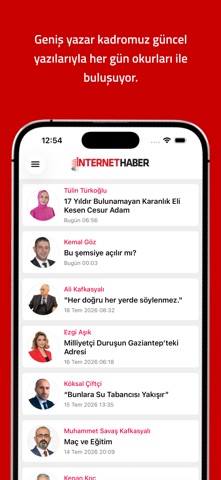
Sampled from 4 of Internet Haber's App Store screenshots — background, accent and theme, measured by LaunchShots (not something Apple publishes).
#CC1414 bg
#D33434
#240C84 accent
#FFFFFF text
Screenshots



iPad screenshots


Icon palette
About this app
Internet Haber iPhone uygulaması ile beraber Türkiye'nin nabzını yakından takip edin! Siyaset, Gündem, Ekonomi, Spor... gibi bir çok kategori ile beraber her an ve her yerde habere erişme imkanı sağlayın! Tarafsız bir bakış açısı ile internette milyonlara ulaşan Internet Haber iPhone uygulaması ile beraber Türkiye ve Dünya'nın gündemini cebinize taşıyor!
App details
What you can learn from Internet Haber
Every shipping app on the App Store has gone through the same decisions you're working through right now: which screenshot goes first, what caption sits over it, which device frame to show, what color the background should be. The 8 screenshots above are Internet Haber's answers to those questions — they're public, they're real, and they made it through Apple's review.
What the numbers say: Internet Haber runs a dark set with one background colour (#CC1414) carried across every screenshot — the listing reads as a single poster when the shots sit side by side in search results. The accent colour we picked up, #240C84, is the one to reuse for badges, arrows and highlighted words if you borrow this look. Hit Use this style to open the editor with these exact colours and drop your own screenshot in.
Notice the first screenshot in particular. It's the one users see in search results and on the product page, and it's where most apps spend their best caption and tightest design. Look at the proportion of background to phone, where the text sits, what one thing the image is trying to communicate.
Want to see how other News apps approach the same problem? Browse more News apps in the showcase.
Take what works into your own screenshots
Open LaunchShots and design your App Store & Google Play screenshots — pick a device frame, drop captions, ship in minutes. Free, in your browser.
Open the screenshot editor →Apps with a similar look
Closest background + accent colours among the listings we've analysed — useful when you want to see the same palette handled by a different team.