Chart position — tracked daily by LaunchShots
Screenshot style breakdown
Sampled from 4 of wa.de's App Store screenshots — background, accent and theme, measured by LaunchShots (not something Apple publishes).
#FCFCFC bg
#DDDDDD
#244C7C accent
#111111 text
Screenshots
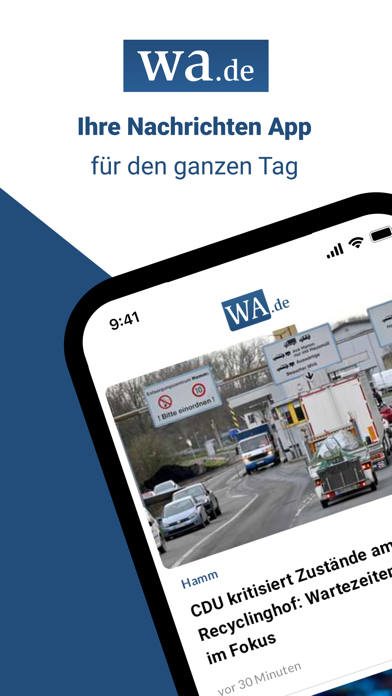
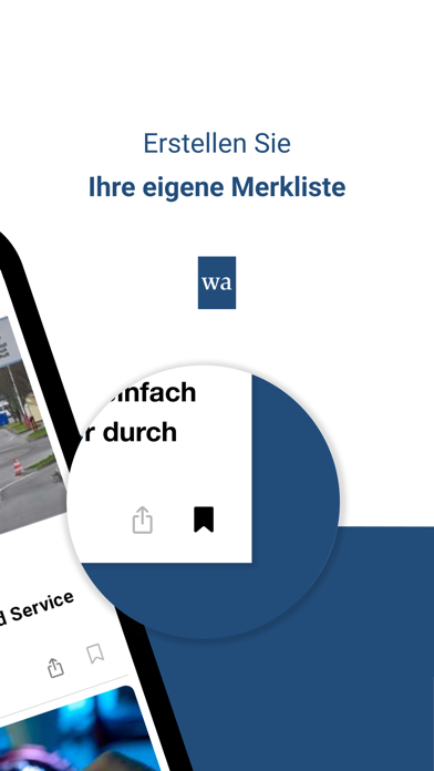
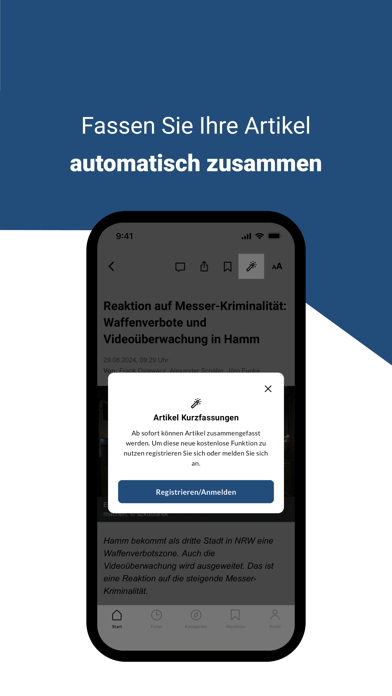

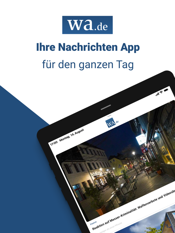
iPad screenshots

Icon palette
About this app
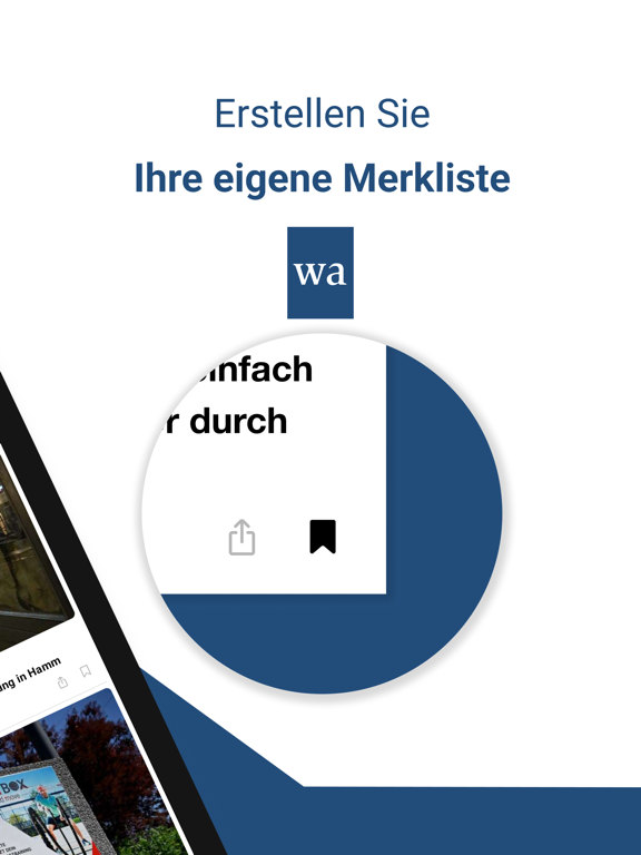
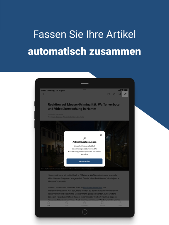
Die kostenlose App von wa.de bringt Ihnen alle Neuigkeiten und Wissenswertes aus Hamm und der Region direkt auf Ihr Smartphone. Aktuelle Nachrichten, Videos, Fotostrecken, große Veranstaltungen und die wichtigsten Informationen aus Ihrer Nachbarschaft - hier verpassen Sie nichts. Mit der optionalen Push-Nachrichten-Funktion werden Sie direkt über alle Neuigkeiten benachrichtigt. Außerdem können Sie interessante Meldungen über die Bookmark-Funktion speichern und später in Ihrer Merkliste abrufen sowie alle Artikel teilen. Richten Sie sich zudem Ihre Startseite nach Ihren Wünschen ein. Wählen Sie Ihre Interessensgebiete und Sie bekommen beim Öffnen der App direkt die aktuellen Nachrichten aus diesen Ressorts angezeigt. In der wa.de-App finden Sie unter anderem Inhalte aus diesen Städten und zu folgenden Themen: Hamm Bönen Bergkamen Werne Drensteinfurt Lokalsport NRW Deutschland & di…
App details
What you can learn from wa.de
Every shipping app on the App Store has gone through the same decisions you're working through right now: which screenshot goes first, what caption sits over it, which device frame to show, what color the background should be. The 8 screenshots above are wa.de's answers to those questions — they're public, they're real, and they made it through Apple's review.
What the numbers say: wa.de runs a mixed light-and-dark set where the background shifts from screenshot to screenshot (first shot #FCFCFC) — each image has to stand on its own, so the captions carry more of the story. The accent colour we picked up, #244C7C, is the one to reuse for badges, arrows and highlighted words if you borrow this look. Hit Use this style to open the editor with these exact colours and drop your own screenshot in.
Notice the first screenshot in particular. It's the one users see in search results and on the product page, and it's where most apps spend their best caption and tightest design. Look at the proportion of background to phone, where the text sits, what one thing the image is trying to communicate.
Want to see how other News apps approach the same problem? Browse more News apps in the showcase.
Take what works into your own screenshots
Open LaunchShots and design your App Store & Google Play screenshots — pick a device frame, drop captions, ship in minutes. Free, in your browser.
Open the screenshot editor →Apps with a similar look
Closest background + accent colours among the listings we've analysed — useful when you want to see the same palette handled by a different team.