Chart position — tracked daily by LaunchShots
Screenshot style breakdown
Sampled from 6 of radiko's App Store screenshots — background, accent and theme, measured by LaunchShots (not something Apple publishes).
#04A4EC bg
#27B0EE
#6CD4C4 accent
#FFFFFF text
Screenshots

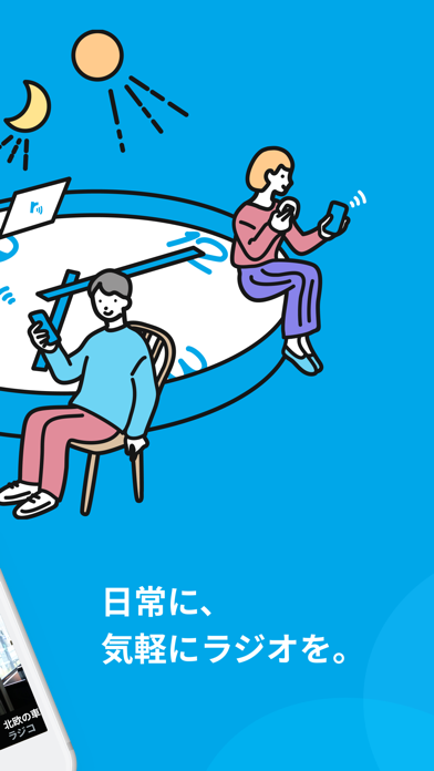


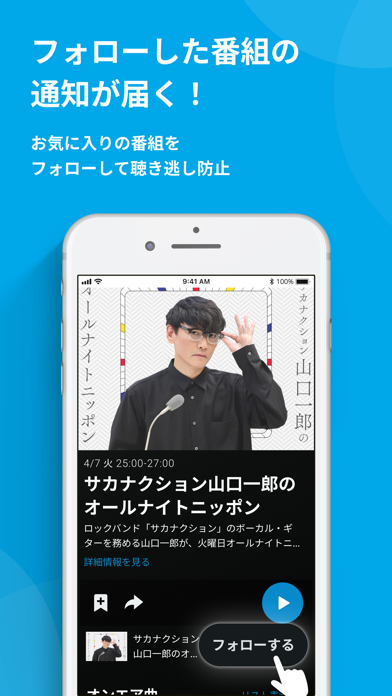


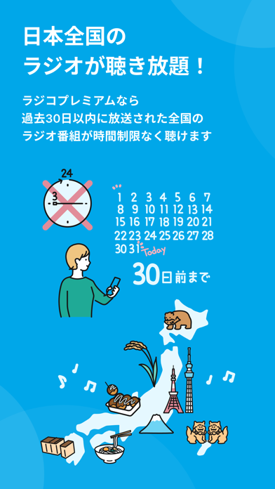
Icon palette
About this app
全国の民放全99局とNHKのラジオとポッドキャストを聴けるアプリです。 ライフスタイルに合わせて、日常のさまざまなシーンで音声コンテンツを聴くことができます。 今日からラジオのある生活をはじめましょう! <無料で使える機能> ■ライブ機能 あなたの今いるエリアで現在放送しているラジオ局の番組を聴くことができます。 ■タイムフリー機能 過去7日以内に放送された番組を、再生し始めてから24時間以内であれば、合計3時間まで、いつでも聴くことができます。 ・好きな深夜番組をつい寝てしまい聴き逃してしまった。 ・好きなタレントがゲスト出演することを知っておきながら、仕事中で聴くことができなかった。 など、タイムフリーなら”聴き逃した番組”を聴くことができます。 ■ポッドキャスト 聴取期限のない録音された番組のことで、オンエアされた番組の再編集版やスピンオフ、オリジナル番組など、様々な音声コンテンツをいつでも楽しめるサービスです。 <ラジコポッドキャストの特徴> ・聴取期限(再生し始めてから24時間以内であれば合計3時間の聴…
App details
What you can learn from radiko
Every shipping app on the App Store has gone through the same decisions you're working through right now: which screenshot goes first, what caption sits over it, which device frame to show, what color the background should be. The 8 screenshots above are radiko's answers to those questions — they're public, they're real, and they made it through Apple's review.
What the numbers say: radiko runs a dark set with one background colour (#04A4EC) carried across every screenshot — the listing reads as a single poster when the shots sit side by side in search results. The accent colour we picked up, #6CD4C4, is the one to reuse for badges, arrows and highlighted words if you borrow this look. Hit Use this style to open the editor with these exact colours and drop your own screenshot in.
Notice the first screenshot in particular. It's the one users see in search results and on the product page, and it's where most apps spend their best caption and tightest design. Look at the proportion of background to phone, where the text sits, what one thing the image is trying to communicate.
Want to see how other Entertainment apps approach the same problem? Browse more Entertainment apps in the showcase.
Take what works into your own screenshots
Open LaunchShots and design your App Store & Google Play screenshots — pick a device frame, drop captions, ship in minutes. Free, in your browser.
Open the screenshot editor →Apps with a similar look
Closest background + accent colours among the listings we've analysed — useful when you want to see the same palette handled by a different team.