Chart position — tracked daily by LaunchShots
Screenshot style breakdown
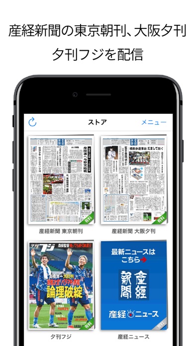
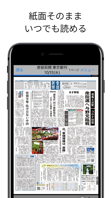
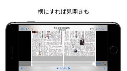
Sampled from 3 of 産経新聞HD's App Store screenshots — background, accent and theme, measured by LaunchShots (not something Apple publishes).
#FCFCFC bg
#DDDDDD
#0C64BC accent
#111111 text
Reading the caption text from the screenshots in your browser…
Screenshots
iPad screenshots
Icon palette
About this app
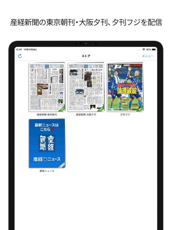
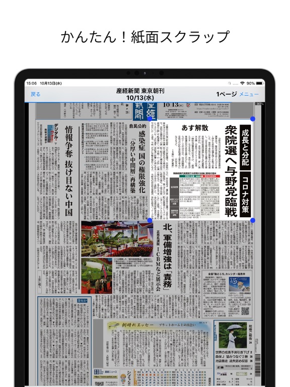
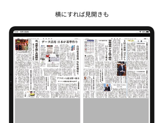
このアプリは「産経電子版」アプリではありません。iOS端末だけでご利用いただくApple課金専用のアプリです。マルチデバイスに対応した「産経電子版」閲覧専用アプリをお探しの方は 「産経電子版」で検索してインストールしてください。 【美しい紙面画像】 産経新聞の紙面を、新聞そのままの体裁で、高精細な画面で美しくご覧いただけるのが「産経新聞HD」です。 【90日分のバックナンバー&切り抜き】 過去90日分のバックナンバーもご利用いただけるほか、記事を切り抜いてアプリ内の「スクラップ帳」に保存することができます。 【購読料】 購読料金は次のとおりです。(いずれも1カ月/自動更新型) ▼産経新聞(東京朝刊、大阪夕刊セット)1,600円 ・産経新聞号外は無料でお読みいただけます 【定期購読の仕組みについて】 ・購読はAppleの自動更新型になっています。 ・お支払いは購読確認時にご利用のアカウントに請求されます。 ・購読期間は、月末月初にかかわらず、購読手続きをされた日から翌月の同日までの購読期間となり、これが自動的に更新されます…
App details
What you can learn from 産経新聞HD
Every shipping app on the App Store has gone through the same decisions you're working through right now: which screenshot goes first, what caption sits over it, which device frame to show, what color the background should be. The 6 screenshots above are 産経新聞HD's answers to those questions — they're public, they're real, and they made it through Apple's review.
What the numbers say: 産経新聞HD runs a light set with one background colour (#FCFCFC) carried across every screenshot — the listing reads as a single poster when the shots sit side by side in search results. The accent colour we picked up, #0C64BC, is the one to reuse for badges, arrows and highlighted words if you borrow this look. Hit Use this style to open the editor with these exact colours and drop your own screenshot in.
Notice the first screenshot in particular. It's the one users see in search results and on the product page, and it's where most apps spend their best caption and tightest design. Look at the proportion of background to phone, where the text sits, what one thing the image is trying to communicate.
Want to see how other News apps approach the same problem? Browse more News apps in the showcase.
Take what works into your own screenshots
Open LaunchShots and design your App Store & Google Play screenshots — pick a device frame, drop captions, ship in minutes. Free, in your browser.
Open the screenshot editor →Apps with a similar look
Closest background + accent colours among the listings we've analysed — useful when you want to see the same palette handled by a different team.