Chart position — tracked daily by LaunchShots
Screenshot style breakdown
Sampled from 5 of Presseportal's App Store screenshots — background, accent and theme, measured by LaunchShots (not something Apple publishes).
#048464 bg
#279579
#647424 accent
#FFFFFF text
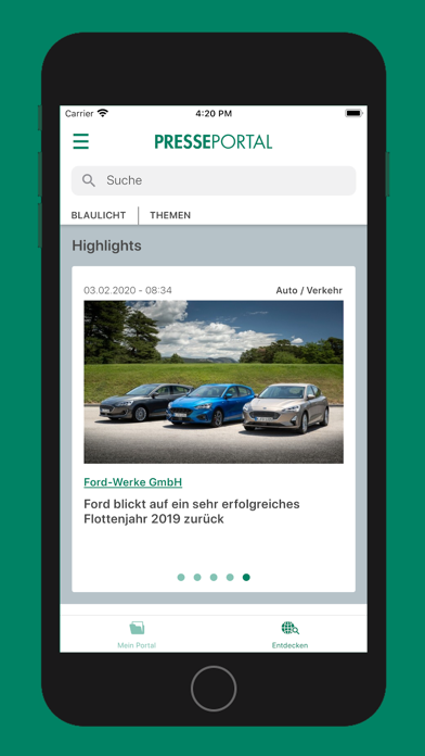
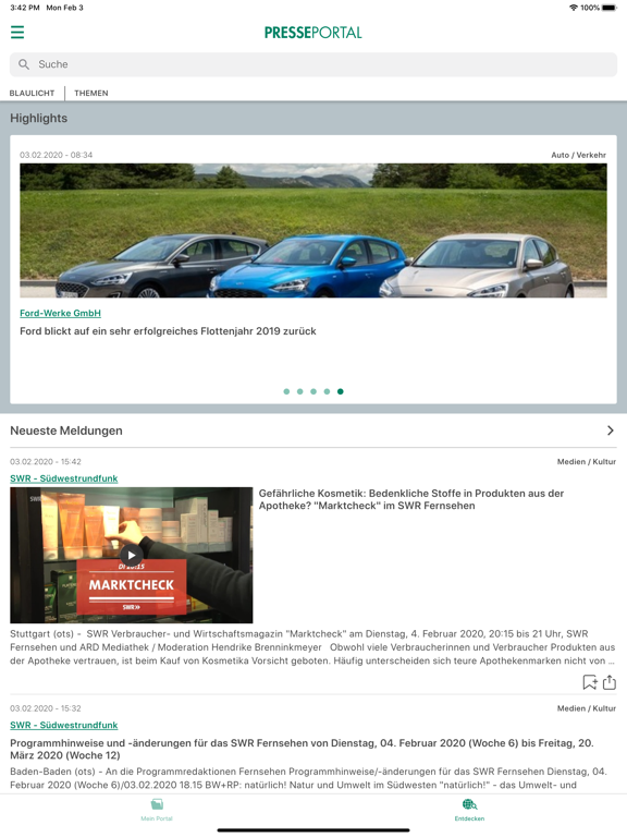
- #1lottenjahr 2019 zurück
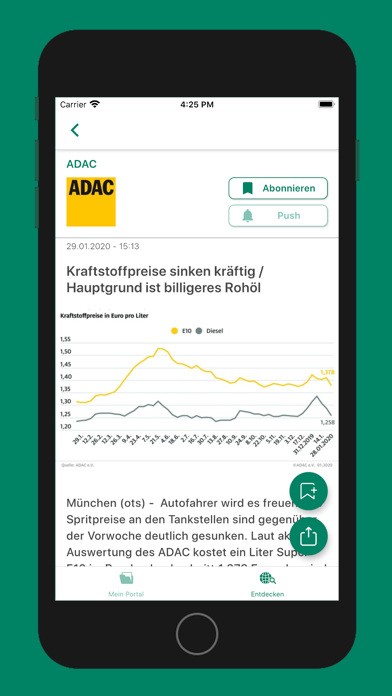
- #2München (ots) - Autofahrer wird es freuel G Spritpreise an den Tankstellen sind gegen; der
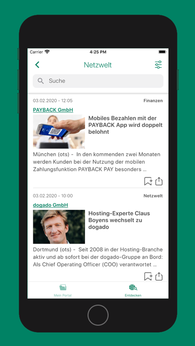
- #3Dortmund (ots) - Seit 2008 in der Hosting-Branche aktiv und ab sofort bel der dogado-Grupp
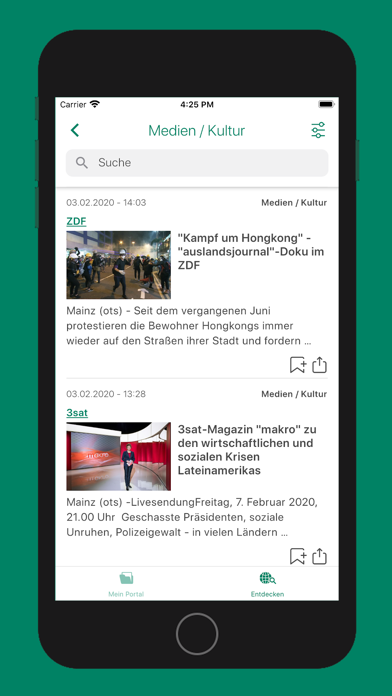
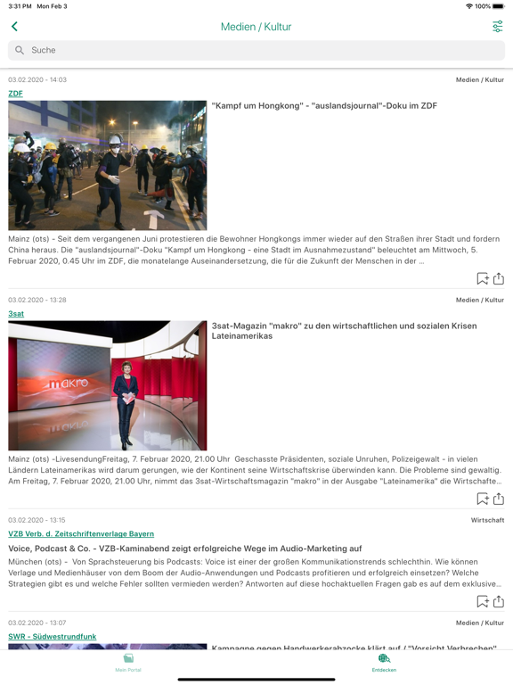
- #4Mainz (ots) -LivesendungFreitag, 7. Februar 2020, 21.00 Uhr Geschasste Präsidenten, sozial
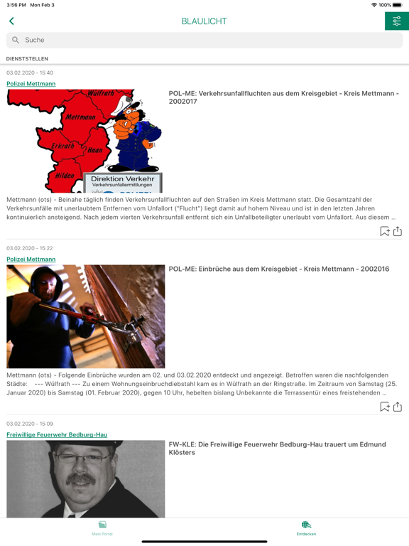
- #5= \ Mettmann (ots) - Folgende Einbrüche wurden am 02. und 03.02.2020 entdeckt und angezeig
Captions read from the screenshots (OCR, may contain small errors): 5 headlines, 11.8 words on average (longest 15).
Screenshots

iPad screenshots


Icon palette
About this app
Presseportal.de ist ein Service von news aktuell. Die dpa-Tochter veröffentlicht täglich mehrere hundert Mitteilungen von Unternehmen, Organisationen und Behörden. * Wir bieten Meldungen aus den Presseabteilungen von Unternehmen und Dienststellen. * Bei uns sehen Sie aktuelle PR-Videos und Image-Clips. * Richten Sie Ihre persönlichen Newsfeed mit Meldungen ein, die wichtig für Sie sind. * Lassen Sie sich automatisch von uns benachrichtigen, sobald eine neue Mitteilung vorliegt, die Sie interessiert. * Alle Inhalte können direkt geshared werden * Wir verbreiten die aktuellen Presseberichte von Polizei, Bundespolizei, Feuerwehr, Zoll & mehr (Rund 350 Dienststellen) Presseportal.de verzeichnet monatlich durchschnittlich 15 Millionen IVW-geprüfte Besuche. Das in dieser App veröffentlichte Material kann kostenfrei verwendet, vervielfältigt oder in andere Websites eingebunden werden.
App details
What you can learn from Presseportal
Every shipping app on the App Store has gone through the same decisions you're working through right now: which screenshot goes first, what caption sits over it, which device frame to show, what color the background should be. The 10 screenshots above are Presseportal's answers to those questions — they're public, they're real, and they made it through Apple's review.
What the numbers say: Presseportal runs a dark set with one background colour (#048464) carried across every screenshot — the listing reads as a single poster when the shots sit side by side in search results. The accent colour we picked up, #647424, is the one to reuse for badges, arrows and highlighted words if you borrow this look. Hit Use this style to open the editor with these exact colours and drop your own screenshot in.
Notice the first screenshot in particular. It's the one users see in search results and on the product page, and it's where most apps spend their best caption and tightest design. Look at the proportion of background to phone, where the text sits, what one thing the image is trying to communicate.
Want to see how other News apps approach the same problem? Browse more News apps in the showcase.
Take what works into your own screenshots
Open LaunchShots and design your App Store & Google Play screenshots — pick a device frame, drop captions, ship in minutes. Free, in your browser.
Open the screenshot editor →Apps with a similar look
Closest background + accent colours among the listings we've analysed — useful when you want to see the same palette handled by a different team.