Screenshots


Icon palette
About this app
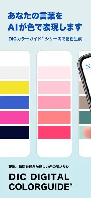
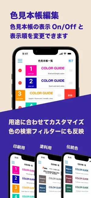
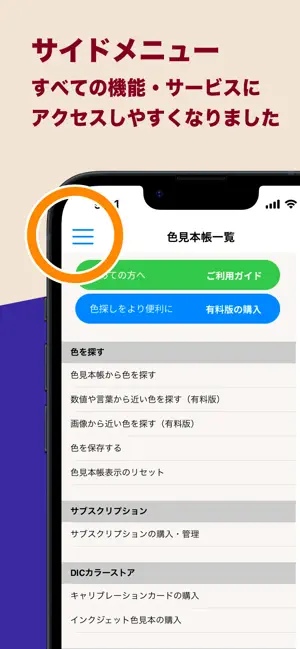
日本でトップシェアを誇る色見本帳「DICカラーガイド」など、3,000色以上を収録したデジタルカラーライブラリアプリです。色を選び、ストックし、伝え、共有することで、あらゆるクリエイティブな場面や製造現場などにおける色コミュニケーションをスムーズにします。 初めての方は、サイドメニュー内「ご利用ガイド」動画をご覧ください。 【主な特長】(※一部機能はサブスクリプション対象) • DICカラーガイドの色情報(RGB、CMYK、インキ配合など)を確認可能 • JPMA塗料用標準色の色相とマンセル値を閲覧可能 • PEONYカラーガイド(HDPE/LDPE用)の色相表示 • 紙・金属・フィルムなど基材ごとの色の見え方を再現 • 日本・フランス・中国の「伝統色シリーズ」も収録(色名・由来を掲載) • お気に入りの色をストックしてテキストメモを追加可能 • Adobe Illustrator, Photoshop用のカラースウォッチ書き出しやメール送信に対応 • 写真画像から近似するDICカラーや日塗工標準色を検索(※要サブスクリプション) • キャリブレーションカード(別売)を使えば、あ…
App details
What you can learn from カラーガイド
Every shipping app on the App Store has gone through the same decisions you're working through right now: which screenshot goes first, what caption sits over it, which device frame to show, what color the background should be. The 6 screenshots above are カラーガイド's answers to those questions — they're public, they're real, and they made it through Apple's review.
Notice the first screenshot in particular. It's the one users see in search results and on the product page, and it's where most apps spend their best caption and tightest design. Look at the proportion of background to phone, where the text sits, what one thing the image is trying to communicate.
Want to see how other Reference apps approach the same problem? Browse more Reference apps in the showcase.
Take what works into your own screenshots
Open LaunchShots and design your App Store & Google Play screenshots — pick a device frame, drop captions, ship in minutes. Free, in your browser.
Open the screenshot editor →