Screenshot style breakdown
Sampled from 6 of 东方财富-股票、炒股、理财's App Store screenshots — background, accent and theme, measured by LaunchShots (not something Apple publishes).
#FCF4F4 bg
#DDD6D6
#EC4434 accent
#111111 text
Screenshots


Icon palette
About this app
东方财富APP又升级啦!东方财富APP覆盖了股票、基金、期货、债券、外汇、银行、保险等诸多金融领域数据,每日更新数万条财经资讯信息,为用户提供便利服务。 特色功能: ●妙想AI——更懂股民的金融大模型,深度思考、专业数据、更懂金融,更优体验 ●股吧——中国高人气股票主题社区,覆盖财经资讯、股友评论、个股行情、股市热点、基本面数据等多个股市实用功能 ●专业数据——覆盖全球重要市场行情 ,汇集股票新股申购、公司资料、证券投资研报等金融行业数百亿条数据 ●开户交易——全程网上股票开户,不排队,更有开户惊喜福利,交易安全、方便、快捷 ●即时提醒——股友互动、市场热点、自选股(公告、研报、数据等)动态消息及时提醒 ●主力资金流——真实还原实时主力大单,揭秘主力资金布局 ●高手跟踪——实盘组合、高手看盘、专业投顾百家争鸣,还有百万奖池的实盘大赛等你参加 ●智能选股——主题投资、画线工具、筹码分布、分时叠加、超级Level-2、盘口异动、资金流向,从选股到分析到盘中决策,智能选股工具为您的投资决策助力 ●丰富活动——好礼天天领,更有丰富模拟活动带你…
App details
What you can learn from 东方财富-股票、炒股、理财
Every shipping app on the App Store has gone through the same decisions you're working through right now: which screenshot goes first, what caption sits over it, which device frame to show, what color the background should be. The 7 screenshots above are 东方财富-股票、炒股、理财's answers to those questions — they're public, they're real, and they made it through Apple's review.
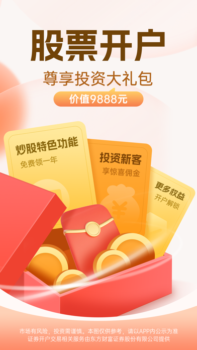
What the numbers say: 东方财富-股票、炒股、理财 runs a light set with one background colour (#FCF4F4) carried across every screenshot — the listing reads as a single poster when the shots sit side by side in search results. The accent colour we picked up, #EC4434, is the one to reuse for badges, arrows and highlighted words if you borrow this look. Hit Use this style to open the editor with these exact colours and drop your own screenshot in.
Notice the first screenshot in particular. It's the one users see in search results and on the product page, and it's where most apps spend their best caption and tightest design. Look at the proportion of background to phone, where the text sits, what one thing the image is trying to communicate.
Want to see how other Finance apps approach the same problem? Browse more Finance apps in the showcase.
Take what works into your own screenshots
Open LaunchShots and design your App Store & Google Play screenshots — pick a device frame, drop captions, ship in minutes. Free, in your browser.
Open the screenshot editor →Apps with a similar look
Closest background + accent colours among the listings we've analysed — useful when you want to see the same palette handled by a different team.