Chart position — tracked daily by LaunchShots
Screenshot style breakdown
Sampled from 6 of Пекин метрополитен's App Store screenshots — background, accent and theme, measured by LaunchShots (not something Apple publishes).
#EC444C bg
#EE5E65
#5C1C1C accent
#FFFFFF text
Screenshots
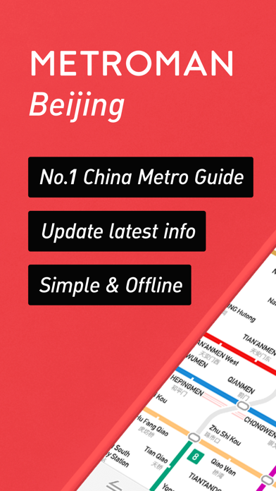
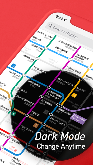
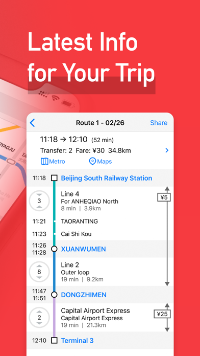
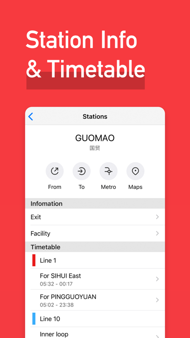
iPad screenshots



Icon palette
About this app
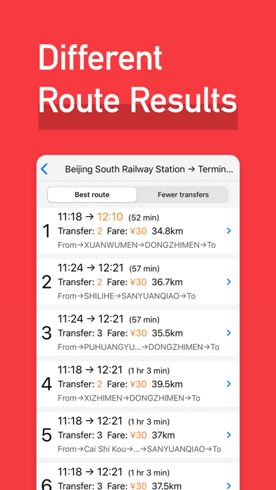
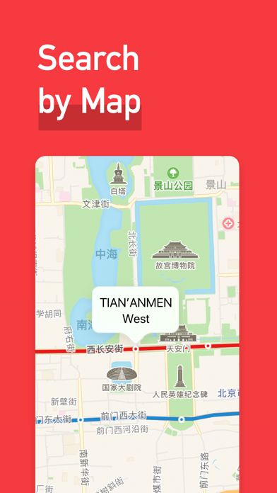
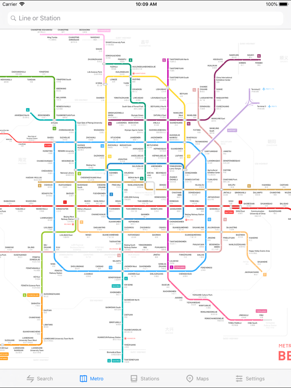
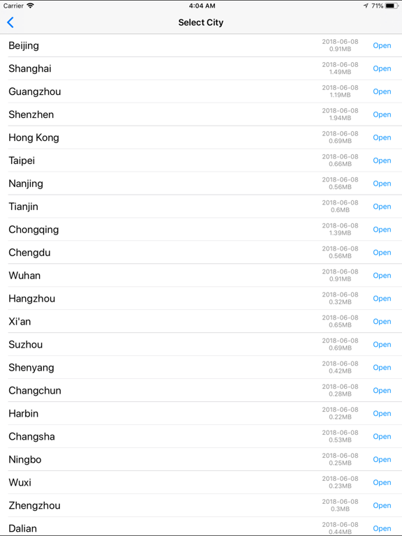
Это лучшее приложение для метро в Пекине. 1. Полностью обновлено на 2026 год Точные схемы метро и полная информация. 2. Планировщик маршрутов Простой и эффективный инструмент планирования маршрутов. Детальная информация о маршрутах, времени и стоимости. 3. Работает без интернета Подключение к интернету не требуется. 4. Поддержка 11 языков English, 简体中文, 繁體中文, 日本語, 한국어, Русский, Français, Español, Deutsch, Português, Italiano. 5. Охват 53 городов Пекин, Шанхай, Гуанчжоу, Шэньчжэнь, Гонконг, Макао, Тайбэй, Тайчжун, Гаосюн, Чанчунь, Чанша, Чанчжоу, Чэнду, Чунцин, Чжучжоу, Далянь, Дунгуань, Фошань, Фучжоу, Гуйян, Хайнин, Ханчжоу, Харбин, Хэфэй, Хух-Хото, Цзинань, Цзиньхуа, Куньмин, Ланьчжоу, Лоян, Наньчан, Нанкин, Наньнин, Наньтун, Нинбо, Циндао, Шаосин, Шэньян, Шицзячжуан, Сучжоу, Тайюань, Тайчжоу, Тяньцзинь, Урумчи, Вэньчжоу, Ухань, Уху, Уси, Сямынь, Сиань, Сюйчан, Сюйч…
App details
What you can learn from Пекин метрополитен
Every shipping app on the App Store has gone through the same decisions you're working through right now: which screenshot goes first, what caption sits over it, which device frame to show, what color the background should be. The 14 screenshots above are Пекин метрополитен's answers to those questions — they're public, they're real, and they made it through Apple's review.
What the numbers say: Пекин метрополитен runs a dark set with one background colour (#EC444C) carried across every screenshot — the listing reads as a single poster when the shots sit side by side in search results. The accent colour we picked up, #5C1C1C, is the one to reuse for badges, arrows and highlighted words if you borrow this look. Hit Use this style to open the editor with these exact colours and drop your own screenshot in.
Notice the first screenshot in particular. It's the one users see in search results and on the product page, and it's where most apps spend their best caption and tightest design. Look at the proportion of background to phone, where the text sits, what one thing the image is trying to communicate.
Want to see how other Navigation apps approach the same problem? Browse more Navigation apps in the showcase.
Take what works into your own screenshots
Open LaunchShots and design your App Store & Google Play screenshots — pick a device frame, drop captions, ship in minutes. Free, in your browser.
Open the screenshot editor →Apps with a similar look
Closest background + accent colours among the listings we've analysed — useful when you want to see the same palette handled by a different team.