Chart position — tracked daily by LaunchShots
Screenshot changes — detected by LaunchShots
Screenshot style breakdown
Sampled from 6 of 東京メトロmy!アプリ【公式】's App Store screenshots — background, accent and theme, measured by LaunchShots (not something Apple publishes).
#D4F4FC bg
#BAD6DD
#043C6C accent
#111111 text
Screenshots


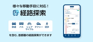

iPad screenshots

Icon palette
About this app
東京メトロ線・都営地下鉄線の運行情報・列車走行位置表示、号車ごとのリアルタイム混雑状況、鉄道・タクシー・シェアサイクル・コミュニティバスなどの多様な移動手段を組み合わせた経路検索等を搭載した、東京メトロ公式の無料アプリです。 東京における大都市型MaaS(Mobility as a Service)の取組み「my! 東京MaaS」を実現するアプリです。 ぜひご利用ください。 【東京メトロmy!アプリの特徴】 ■首都圏を中心として、出発地から目的地へ、地下鉄や鉄道だけではなく、徒歩、路線バス、タクシー、シェアサイクル等を含めた「マルチモーダル」な経路の検索が可能です! ・経路検索の対象範囲 <鉄道・軌道>東京メトロ、都営地下鉄、東京さくらトラム(都電荒川線)、日暮里・舎人ライナー、相互直通運転を行う鉄道会社をはじめとする首都圏鉄道各線 他 <バス>都営バス、路線バス、コミュニティバス(台東区循環バス「めぐりん」など)、空港連絡バス 他 <シェアサイクル>ドコモ・バイクシェア、HELLO CYCLING ※ドコモ・バイクシェアは、株式会社ドコモ・バイ…
App details
What you can learn from 東京メトロmy!アプリ【公式】
Every shipping app on the App Store has gone through the same decisions you're working through right now: which screenshot goes first, what caption sits over it, which device frame to show, what color the background should be. The 7 screenshots above are 東京メトロmy!アプリ【公式】's answers to those questions — they're public, they're real, and they made it through Apple's review.
What the numbers say: 東京メトロmy!アプリ【公式】 runs a light set with one background colour (#D4F4FC) carried across every screenshot — the listing reads as a single poster when the shots sit side by side in search results. The accent colour we picked up, #043C6C, is the one to reuse for badges, arrows and highlighted words if you borrow this look. Hit Use this style to open the editor with these exact colours and drop your own screenshot in.
Notice the first screenshot in particular. It's the one users see in search results and on the product page, and it's where most apps spend their best caption and tightest design. Look at the proportion of background to phone, where the text sits, what one thing the image is trying to communicate.
Want to see how other Navigation apps approach the same problem? Browse more Navigation apps in the showcase.
Take what works into your own screenshots
Open LaunchShots and design your App Store & Google Play screenshots — pick a device frame, drop captions, ship in minutes. Free, in your browser.
Open the screenshot editor →Apps with a similar look
Closest background + accent colours among the listings we've analysed — useful when you want to see the same palette handled by a different team.