Chart position — tracked daily by LaunchShots
Screenshot changes — detected by LaunchShots
Screenshot style breakdown
Sampled from 6 of 自転車NAVITIME-サイクリングナビと速度計測・マップ's App Store screenshots — background, accent and theme, measured by LaunchShots (not something Apple publishes).
#0474CC bg
#2787D3
#FC7C04 accent
#FFFFFF text
Screenshots
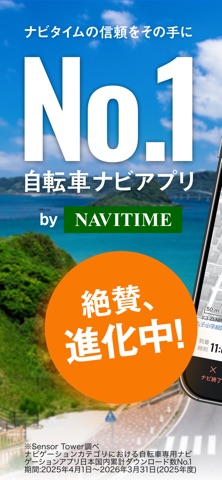

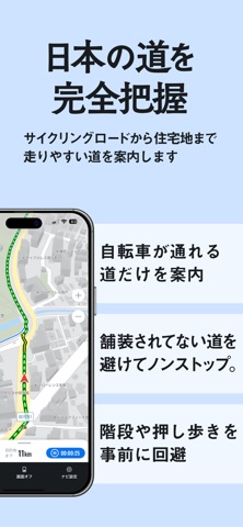
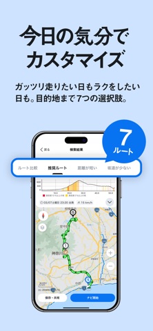
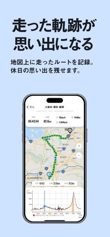

Icon palette
About this app
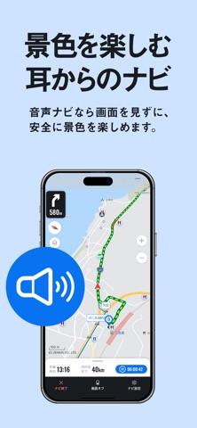
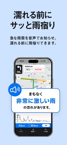
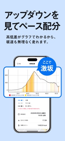
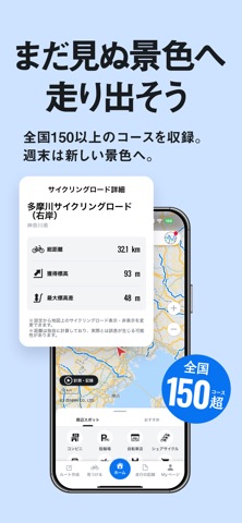
サイクリングをより快適に強力サポート! 自転車に特化したナビゲーションアプリです。 自転車を利用した宅配や通勤にもご利用いただけます。 ***** 主な機能紹介 ***** ◆[ルート検索] 自転車通行可能な道路だけを使ったルートを検索、走行速度を設定して正確な所要時間を確認することができます。 また、ルートは未舗装の道路や立ちゴケしやすい急左折を回避し、一部の自転車通行空間にも対応しております。 通常:推奨ルートを利用可能 プレミアムコースへ登録すると:推奨を含む以下の全7種類のルートを利用可能 ・推奨(距離・時間・高低差、車の交通量などを考慮したルート) ・距離が短い ・坂道が少ない ・坂道が多い ・大通り優先 ・裏通り優先 ・サイクリングロード優先(近くにあるサイクリングロードを優先的に通る) ◆[音声ナビゲーション] プレミアムコースへ登録すると:回数無制限で利用可能! また、天気の変化や事故多発地点もお知らせします。 ◆[周遊ルート] 走りたい距離を指定すると、その距離に応じたサイクリ…
App details
What you can learn from 自転車NAVITIME-サイクリングナビと速度計測・マップ
Every shipping app on the App Store has gone through the same decisions you're working through right now: which screenshot goes first, what caption sits over it, which device frame to show, what color the background should be. The 10 screenshots above are 自転車NAVITIME-サイクリングナビと速度計測・マップ's answers to those questions — they're public, they're real, and they made it through Apple's review.
What the numbers say: 自転車NAVITIME-サイクリングナビと速度計測・マップ runs a mixed light-and-dark set where the background shifts from screenshot to screenshot (first shot #0474CC) — each image has to stand on its own, so the captions carry more of the story. The accent colour we picked up, #FC7C04, is the one to reuse for badges, arrows and highlighted words if you borrow this look. Hit Use this style to open the editor with these exact colours and drop your own screenshot in.
Notice the first screenshot in particular. It's the one users see in search results and on the product page, and it's where most apps spend their best caption and tightest design. Look at the proportion of background to phone, where the text sits, what one thing the image is trying to communicate.
Want to see how other Navigation apps approach the same problem? Browse more Navigation apps in the showcase.
Take what works into your own screenshots
Open LaunchShots and design your App Store & Google Play screenshots — pick a device frame, drop captions, ship in minutes. Free, in your browser.
Open the screenshot editor →Apps with a similar look
Closest background + accent colours among the listings we've analysed — useful when you want to see the same palette handled by a different team.