Chart position — tracked daily by LaunchShots
Screenshot style breakdown
Sampled from 5 of Nabd News's App Store screenshots — background, accent and theme, measured by LaunchShots (not something Apple publishes).
#040404 bg
#272727
#4474AC accent
#FFFFFF text
Screenshots
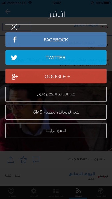
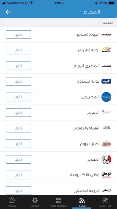

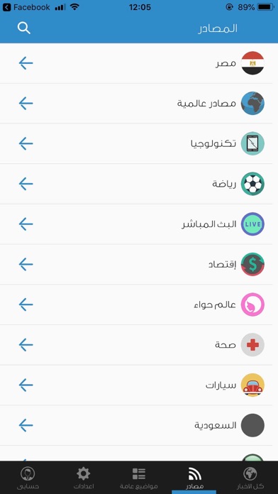
Icon palette
About this app
نبض هو تطبيق للأخبار العربية يجمع الأخبار من أكثر من 25 مصدراَ صحفياَ هي أهم المصادر الصحفية في مصر لتصبح جاهزة للتصفح في واجهة سهلة ومريحة. تتضمن مصادر نبض كل من "الأهرام"، "المصري اليوم"، "الشروق"، "الجزيرة"، "الدستور الأصلي"، "اليوم السابع"، "رويترز"، "أون تي في"، "ياهو"، "في الجول"، "في الفن". يأتي نبض بالأخبار من أهم وأفضل مصادرها المعروفة المجالات المختلفة مثل "الأخبار العامة"، "الفن"، "الاقتصاد"، "الرياضة" وأقسام أخري. يتيح نبض متابعة أهم ما يقوله الناس علي موقع التواصل الاجتماعي تويتر بخصوص مصر، وأيضاَ نشر الأخبار علي مواقع التواصل الاجتماعي فيس بوك وتويتر أو عن طريق البريد الإليكتروني. من خلال قسم الفيديو يجمع نبض أهم التغطيات الصحفية المصورة وأهم الفيديوهات التي تم إضافتها علي موقع يوتيوب، بالإضافة لإمكانية تصفح أهم الأحداث الثقافية القادمة من خلال قسم "الأحداث الثقافية". Nabd news is an Arabic news application that offers an easy and convenient way to read news by present…
App details
What you can learn from Nabd News
Every shipping app on the App Store has gone through the same decisions you're working through right now: which screenshot goes first, what caption sits over it, which device frame to show, what color the background should be. The 5 screenshots above are Nabd News's answers to those questions — they're public, they're real, and they made it through Apple's review.
What the numbers say: Nabd News runs a mixed light-and-dark set where the background shifts from screenshot to screenshot (first shot #040404) — each image has to stand on its own, so the captions carry more of the story. The accent colour we picked up, #4474AC, is the one to reuse for badges, arrows and highlighted words if you borrow this look. Hit Use this style to open the editor with these exact colours and drop your own screenshot in.
Notice the first screenshot in particular. It's the one users see in search results and on the product page, and it's where most apps spend their best caption and tightest design. Look at the proportion of background to phone, where the text sits, what one thing the image is trying to communicate.
Want to see how other News apps approach the same problem? Browse more News apps in the showcase.
Take what works into your own screenshots
Open LaunchShots and design your App Store & Google Play screenshots — pick a device frame, drop captions, ship in minutes. Free, in your browser.
Open the screenshot editor →Apps with a similar look
Closest background + accent colours among the listings we've analysed — useful when you want to see the same palette handled by a different team.