Screenshot style breakdown
Sampled from 5 of あめふるコール's App Store screenshots — background, accent and theme, measured by LaunchShots (not something Apple publishes).
#4454F4 bg
#5E6BF5
#34447C accent
#FFFFFF text
Reading the caption text from the screenshots in your browser…
Screenshots
iPad screenshots
Icon palette
About this app
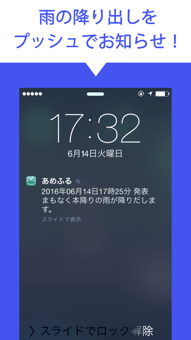
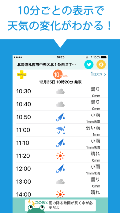
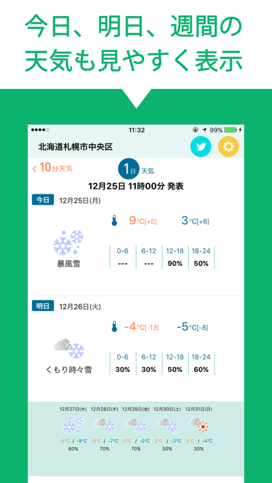
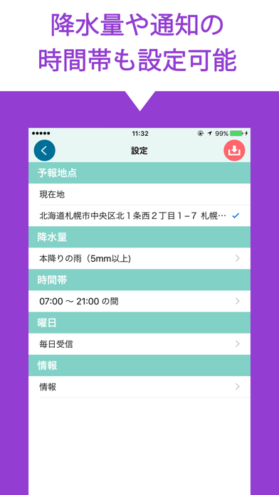
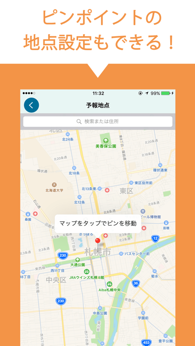
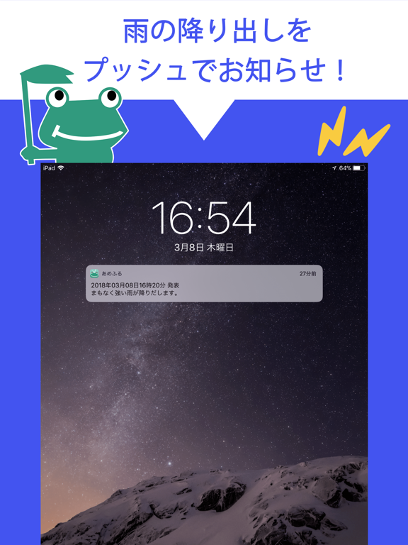
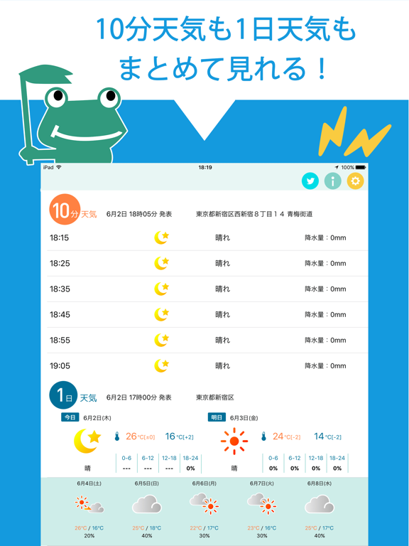
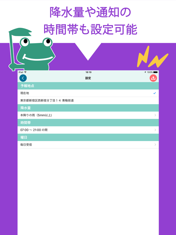
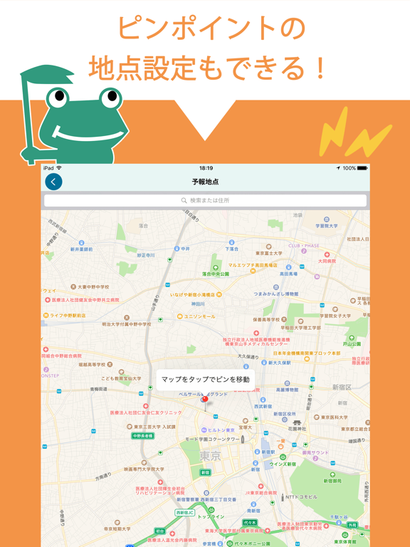
◆あめふる予報の通知 一時間以内に雨が降ると予想された場合に、発表時刻と設定地点の雨の強さ(弱い雨、本降りの雨等)をプッシュ通知します 予報地点の設定を現在地にすることで、移動の度に地点を変更する手間も無くなります! ◆通知条件の設定 通知地点は地図よりピンポイントの指定が可能! 通知降水量は雨の強さ(弱い雨、本降りの雨等)で指定できます ◆天気予報情報の表示 あめふるコールだけの、一時間先までの10分毎の天気予報の確認ができます。 今日・明日の天気、週間天気予報もわかるので、雨の心配はこれ1つで解決! ◆+ソナエで風水害にそなえる +ソナエでは風水害が発生したときに役立つ情報や、日頃から確認しておきたい防災知識をイラスト付きでわかりやすく解説しています。 《設定方法》 1.設定画面より通知降水量、予報地点、通知する曜日、通知する時間を設定します。 2.保存ボタンを押して、設定を保存します。(サーバとの通信が発生します。) 3.お使いの端末でプッシュ通知サービスを許可して下さい。 《ご利用に際しての注意》 …
App details
What you can learn from あめふるコール
Every shipping app on the App Store has gone through the same decisions you're working through right now: which screenshot goes first, what caption sits over it, which device frame to show, what color the background should be. The 9 screenshots above are あめふるコール's answers to those questions — they're public, they're real, and they made it through Apple's review.
What the numbers say: あめふるコール runs a mixed light-and-dark set where the background shifts from screenshot to screenshot (first shot #4454F4) — each image has to stand on its own, so the captions carry more of the story. The accent colour we picked up, #34447C, is the one to reuse for badges, arrows and highlighted words if you borrow this look. Hit Use this style to open the editor with these exact colours and drop your own screenshot in.
Notice the first screenshot in particular. It's the one users see in search results and on the product page, and it's where most apps spend their best caption and tightest design. Look at the proportion of background to phone, where the text sits, what one thing the image is trying to communicate.
Want to see how other Weather apps approach the same problem? Browse more Weather apps in the showcase.
Take what works into your own screenshots
Open LaunchShots and design your App Store & Google Play screenshots — pick a device frame, drop captions, ship in minutes. Free, in your browser.
Open the screenshot editor →Apps with a similar look
Closest background + accent colours among the listings we've analysed — useful when you want to see the same palette handled by a different team.