Chart position — tracked daily by LaunchShots
Screenshot changes — detected by LaunchShots
Screenshot style breakdown
Sampled from 5 of ДругВокруг: чат и знакомства's App Store screenshots — background, accent and theme, measured by LaunchShots (not something Apple publishes).
#EC1C34 bg
#EE3B50
#4C1414 accent
#FFFFFF text
Screenshots


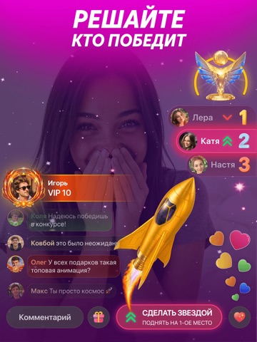
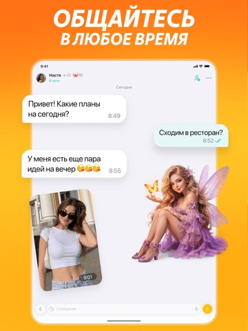
iPad screenshots



Icon palette
About this app
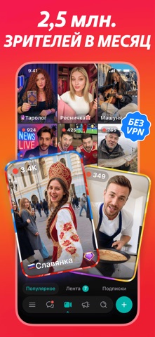
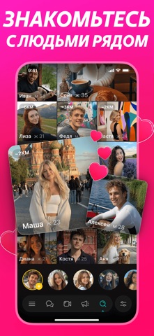
ДругВокруг - бесплатное приложение для общения и поиска новых друзей! • НАЙДИ НОВЫХ ДРУЗЕЙ Тысячи интересных девушек и парней онлайн в твоем городе готовы знакомиться и общаться. Найти новых друзей очень просто: выходи в онлайн, заполни профиль, укажи свои интересы, загрузи фото и встречай гостей в своем профиле! Или будь активнее - напиши в Прямой Эфир, люди со всей страны или из твоего города увидят твое сообщение и обязательно тебе напишут, или даже захотят дружить с тобой. Находи друзей в других городах - пиши в гостевые эфиры. Всегда интересно знать, как живут люди в другом городе, чем интересуются, чем увлекаются. Или же ты можешь воспользоваться нашим мощным поиском, чтобы найти новых друзей, укажи возраст, пол, город и интересы - и вуаля - множество интересных девушек и парней в онлайне и готовы общаться с тобой. Просто отправь им смайлик или клевый стикер - и вы уже общаетесь!…
App details
What you can learn from ДругВокруг: чат и знакомства
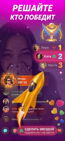
Every shipping app on the App Store has gone through the same decisions you're working through right now: which screenshot goes first, what caption sits over it, which device frame to show, what color the background should be. The 10 screenshots above are ДругВокруг: чат и знакомства's answers to those questions — they're public, they're real, and they made it through Apple's review.
What the numbers say: ДругВокруг: чат и знакомства runs a dark set where the background shifts from screenshot to screenshot (first shot #EC1C34) — each image has to stand on its own, so the captions carry more of the story. The accent colour we picked up, #4C1414, is the one to reuse for badges, arrows and highlighted words if you borrow this look. Hit Use this style to open the editor with these exact colours and drop your own screenshot in.
Notice the first screenshot in particular. It's the one users see in search results and on the product page, and it's where most apps spend their best caption and tightest design. Look at the proportion of background to phone, where the text sits, what one thing the image is trying to communicate.
Want to see how other Social Networking apps approach the same problem? Browse more Social Networking apps in the showcase.
Take what works into your own screenshots
Open LaunchShots and design your App Store & Google Play screenshots — pick a device frame, drop captions, ship in minutes. Free, in your browser.
Open the screenshot editor →Apps with a similar look
Closest background + accent colours among the listings we've analysed — useful when you want to see the same palette handled by a different team.