Chart position — tracked daily by LaunchShots
Screenshot style breakdown
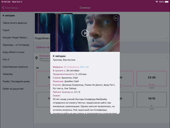
Sampled from 5 of Киномакс's App Store screenshots — background, accent and theme, measured by LaunchShots (not something Apple publishes).
#842C94 bg
#9549A2
#D45CAC accent
#FFFFFF text
Screenshots
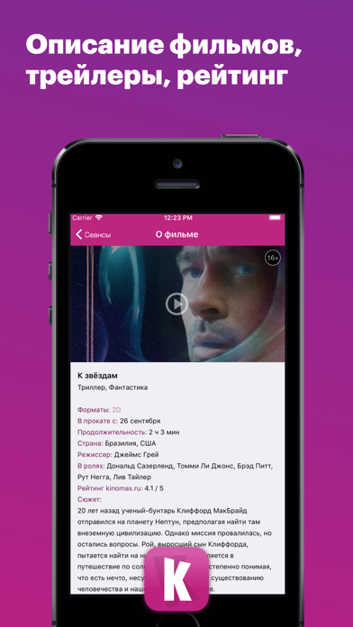
iPad screenshots

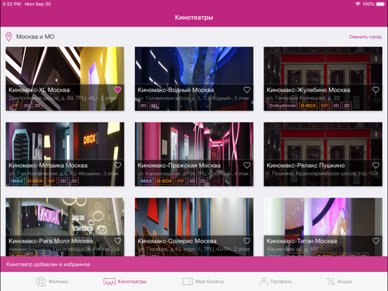
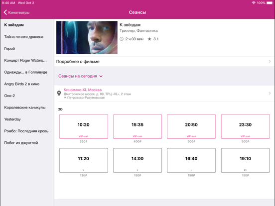
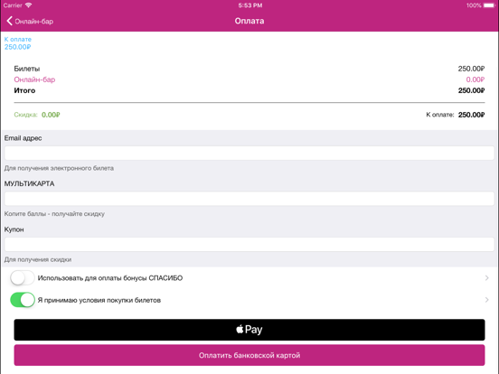
Icon palette
About this app
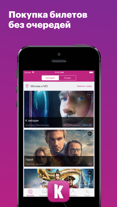
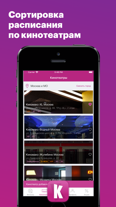
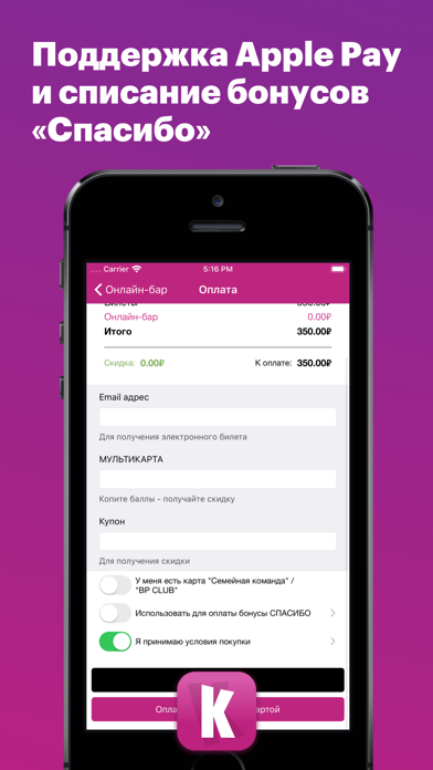
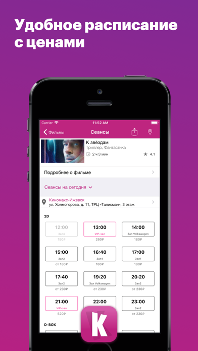
Официальное приложение «КИНОМАКС» - покупайте билеты со скидкой и без очередей. Наши преимущества: √ Актуальное расписание по всем кинотеатрам «КИНОМАКС» √ Обновленный дизайн приложения с поддержкой планшетов √ Покупка билетов и товаров со скидкой в рамках онлайн акций √ Мы принимаем бонусы Спасибо от Сбербанка √ Покупка билетов с помощью Пушкинской карты √ Отправка информации по билетам на ваш email √ Навигация до ближайшего кинотеатра √ Подробное описание фильмов с трейлером и рейтингом от Киномакс √ Раздел «Мои билеты» с информацией о покупках и историей всех совершенных заказов √ Единый список билетов на всех устройствах в разделе «Мои билеты» √ Информация о бонусах Мультикарты в разделе «Личный кабинет» √ Легкий возврат билетов с компенсацией полной стоимости билетов √ Поддержка QR-кода для безбилетного прохода в кинотеатр √ Автоматическая сортировка контента в зависимости от ра…
App details
What you can learn from Киномакс
Every shipping app on the App Store has gone through the same decisions you're working through right now: which screenshot goes first, what caption sits over it, which device frame to show, what color the background should be. The 10 screenshots above are Киномакс's answers to those questions — they're public, they're real, and they made it through Apple's review.
What the numbers say: Киномакс runs a dark set with one background colour (#842C94) carried across every screenshot — the listing reads as a single poster when the shots sit side by side in search results. The accent colour we picked up, #D45CAC, is the one to reuse for badges, arrows and highlighted words if you borrow this look. Hit Use this style to open the editor with these exact colours and drop your own screenshot in.
Notice the first screenshot in particular. It's the one users see in search results and on the product page, and it's where most apps spend their best caption and tightest design. Look at the proportion of background to phone, where the text sits, what one thing the image is trying to communicate.
Want to see how other Entertainment apps approach the same problem? Browse more Entertainment apps in the showcase.
Take what works into your own screenshots
Open LaunchShots and design your App Store & Google Play screenshots — pick a device frame, drop captions, ship in minutes. Free, in your browser.
Open the screenshot editor →Apps with a similar look
Closest background + accent colours among the listings we've analysed — useful when you want to see the same palette handled by a different team.