Chart position — tracked daily by LaunchShots
Screenshot changes — detected by LaunchShots
Screenshot style breakdown
Sampled from 6 of イトーヨーカドー・ヨーク公式アプリ's App Store screenshots — background, accent and theme, measured by LaunchShots (not something Apple publishes).
#DC0414 bg
#E02734
#F47C04 accent
#FFFFFF text
Screenshots


iPad screenshots


Icon palette
About this app
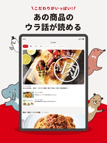
お店のセール情報やチラシ情報をいち早くお届けします。 アプリ限定のクーポンでおトクにお買い物ができます ■クーポンでおトクがいっぱい! レジでアプリバーコードと一緒に見せるだけの簡単なお値引きクーポンや、ポイントが貯まるおトクなクーポンを配信します。 ■よく行く店舗のチラシを自由に保存! マイストアに登録した店舗のチラシの確認はもちろん、必要なところだけチラシを切り取って保存することができます。 ■簡単便利なメモを活用! アプリの中でお買い物のメモをすることができます。 フリーテキストでの入力や、チラシ、クーポンも保存することができます。 ■お買物履歴で便利に振り返り レジでアプリバーコードを提示すると、後日アプリ内でお買い物の履歴を確認することができます。 ■はとぼん記事を配信中 季節にピッタリの話題や商品のこだわりやウラ話など、いろいろなコンテンツをお届けします! ■レジ待ちのない快適なお買い物「レジぽ」 お使いのスマートフォンを使って、店内で商品のバーコードを読み取りながらお買い物をすることで…
App details
What you can learn from イトーヨーカドー・ヨーク公式アプリ
Every shipping app on the App Store has gone through the same decisions you're working through right now: which screenshot goes first, what caption sits over it, which device frame to show, what color the background should be. The 16 screenshots above are イトーヨーカドー・ヨーク公式アプリ's answers to those questions — they're public, they're real, and they made it through Apple's review.
What the numbers say: イトーヨーカドー・ヨーク公式アプリ runs a mixed light-and-dark set where the background shifts from screenshot to screenshot (first shot #DC0414) — each image has to stand on its own, so the captions carry more of the story. The accent colour we picked up, #F47C04, is the one to reuse for badges, arrows and highlighted words if you borrow this look. Hit Use this style to open the editor with these exact colours and drop your own screenshot in.
Notice the first screenshot in particular. It's the one users see in search results and on the product page, and it's where most apps spend their best caption and tightest design. Look at the proportion of background to phone, where the text sits, what one thing the image is trying to communicate.
Want to see how other Lifestyle apps approach the same problem? Browse more Lifestyle apps in the showcase.
Take what works into your own screenshots
Open LaunchShots and design your App Store & Google Play screenshots — pick a device frame, drop captions, ship in minutes. Free, in your browser.
Open the screenshot editor →Apps with a similar look
Closest background + accent colours among the listings we've analysed — useful when you want to see the same palette handled by a different team.