Chart position — tracked daily by LaunchShots
Screenshot style breakdown
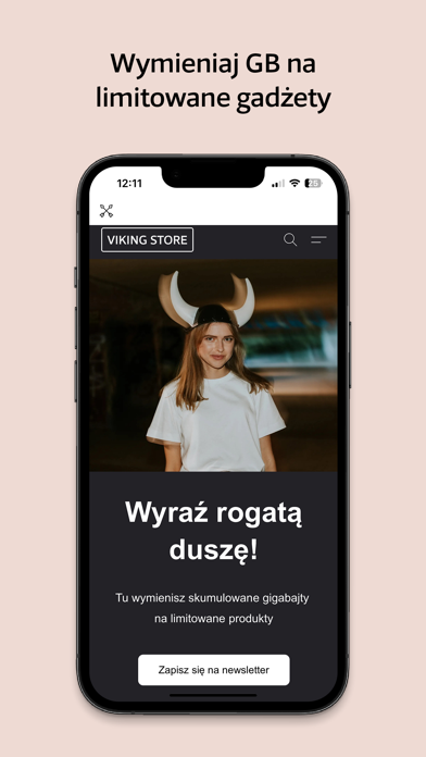
Sampled from 6 of Viking App Poland's App Store screenshots — background, accent and theme, measured by LaunchShots (not something Apple publishes).
#CC0404 bg
#D32727
#FC6404 accent
#FFFFFF text
Screenshots


Icon palette
About this app
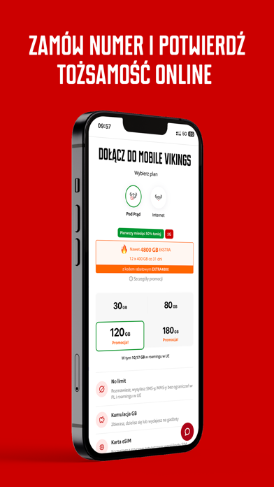
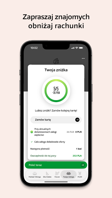
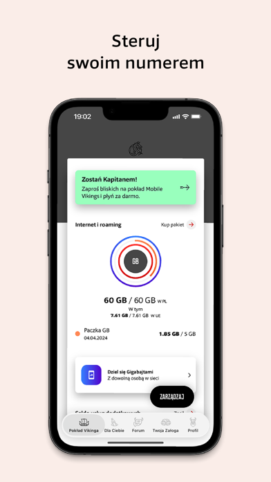
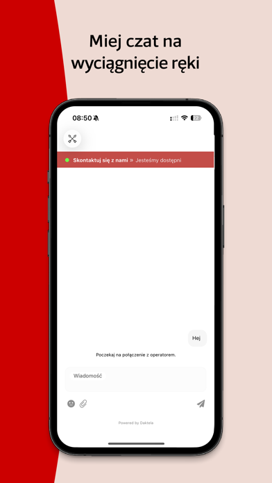
Ahoj! Oto VikingApp - oficjalna aplikacja użytkowników operatora Mobile Vikings Sieć ludzi, nie numerów. Wszystko, co potrzebne do sterowania numerem, masz zawsze pod ręką, pełna wygoda! Co znajdziesz w środku? - aktualne informacje na temat stanu Twojego konta: ilość wykorzystanego Internetu, kwota pozostała na saldzie, stan pakietów; - zarządzanie płatnościami i możliwość podpięcia/odpięcia karty płatniczej; - możliwość zapraszania znajomych do sieci oraz informacje o obecnym stanie Twojej załogi i otrzymywanych dzięki niej zniżkach; - informacje o ilości niewykorzystanych GB i opcję dzielenia się nimi z bliskimi (a także tymi odległymi, jeśli masz na to chęć); - wiadomości i ciekawostki ze świata Vikingów; - szybki kontakt z najlepszym Help Deskiem świata. Dlaczego najlepszym? Bo pracują w nim tylko super pomocni ludzie, a nie mało ogarnięte boty; - nasz autorski sklep, w którym w…
App details
What you can learn from Viking App Poland
Every shipping app on the App Store has gone through the same decisions you're working through right now: which screenshot goes first, what caption sits over it, which device frame to show, what color the background should be. The 7 screenshots above are Viking App Poland's answers to those questions — they're public, they're real, and they made it through Apple's review.
What the numbers say: Viking App Poland runs a mixed light-and-dark set where the background shifts from screenshot to screenshot (first shot #CC0404) — each image has to stand on its own, so the captions carry more of the story. The accent colour we picked up, #FC6404, is the one to reuse for badges, arrows and highlighted words if you borrow this look. Hit Use this style to open the editor with these exact colours and drop your own screenshot in.
Notice the first screenshot in particular. It's the one users see in search results and on the product page, and it's where most apps spend their best caption and tightest design. Look at the proportion of background to phone, where the text sits, what one thing the image is trying to communicate.
Want to see how other Utilities apps approach the same problem? Browse more Utilities apps in the showcase.
Take what works into your own screenshots
Open LaunchShots and design your App Store & Google Play screenshots — pick a device frame, drop captions, ship in minutes. Free, in your browser.
Open the screenshot editor →Apps with a similar look
Closest background + accent colours among the listings we've analysed — useful when you want to see the same palette handled by a different team.