Chart position — tracked daily by LaunchShots
Screenshot style breakdown
Sampled from 5 of دليل الهاتف السعودي's App Store screenshots — background, accent and theme, measured by LaunchShots (not something Apple publishes).
#0C4434 bg
#2E5E50
#249474 accent
#FFFFFF text
Reading the caption text from the screenshots in your browser…
Screenshots


iPad screenshots


Icon palette
About this app
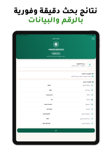
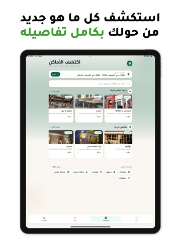
دليل الهاتف السعودي — كاشف الأرقام وكشف المكالمات المزعجة اعرف من المتصل قبل أن ترد! «دليل الهاتف السعودي» هو تطبيقك الذكي للتعرّف على المتصلين، كشف الأرقام المزعجة والاحتيالية، والبحث عن أي رقم هاتف خلال ثوانٍ — بواجهة عربية سهلة وسريعة. كشف الأرقام والتعرّف على المتصل ابحث عن أي رقم هاتف واحصل فوراً على تقرير كامل: هوية المتصل، شركة الاتصال، نوع الخط (جوّال أو أرضي)، الدولة والمنطقة والمدينة، والمزيد. كشف المكالمات المزعجة والاحتيال (سبام) لكل رقم درجة خطورة دقيقة تكشف المكالمات المزعجة والمحتالة قبل أن ترد — احمِ نفسك وعائلتك من أرقام النصب والإزعاج. التعرّف على المتصل وحظر المزعجين فعّل خدمة التعرّف على المتصل من إعدادات الهاتف ليظهر تنبيه «مكالمة مزعجة» عند اتصال الأرقام المشبوهة، مع إمكانية حظر الأرقام المزعجة — كل ذلك يعمل بخصوصية تامة دون الوصول إلى مكالماتك. الأماكن القريبة منك اكتشف المطاعم والكافيهات والحدائق والكثير من الأماكن من حولك، واعرف ساعات العمل ورقم الهاتف …
App details
What you can learn from دليل الهاتف السعودي
Every shipping app on the App Store has gone through the same decisions you're working through right now: which screenshot goes first, what caption sits over it, which device frame to show, what color the background should be. The 9 screenshots above are دليل الهاتف السعودي's answers to those questions — they're public, they're real, and they made it through Apple's review.
What the numbers say: دليل الهاتف السعودي runs a mixed light-and-dark set where the background shifts from screenshot to screenshot (first shot #0C4434) — each image has to stand on its own, so the captions carry more of the story. The accent colour we picked up, #249474, is the one to reuse for badges, arrows and highlighted words if you borrow this look. Hit Use this style to open the editor with these exact colours and drop your own screenshot in.
Notice the first screenshot in particular. It's the one users see in search results and on the product page, and it's where most apps spend their best caption and tightest design. Look at the proportion of background to phone, where the text sits, what one thing the image is trying to communicate.
Want to see how other Entertainment apps approach the same problem? Browse more Entertainment apps in the showcase.
Take what works into your own screenshots
Open LaunchShots and design your App Store & Google Play screenshots — pick a device frame, drop captions, ship in minutes. Free, in your browser.
Open the screenshot editor →Apps with a similar look
Closest background + accent colours among the listings we've analysed — useful when you want to see the same palette handled by a different team.