Chart position — tracked daily by LaunchShots
Screenshot changes — detected by LaunchShots
Screenshot style breakdown
Sampled from 6 of カラオケ ジャンカラ's App Store screenshots — background, accent and theme, measured by LaunchShots (not something Apple publishes).
#E40414 bg
#E72734
#FCF464 accent
#FFFFFF text
Screenshots


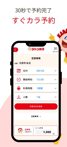


iPad screenshots
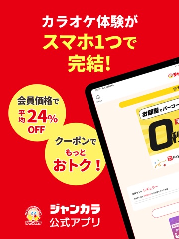


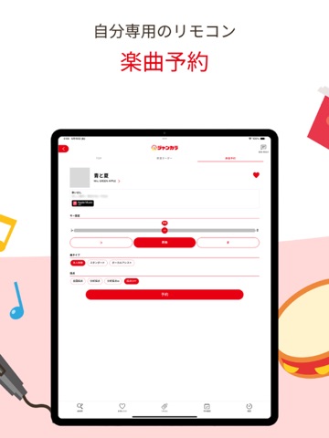
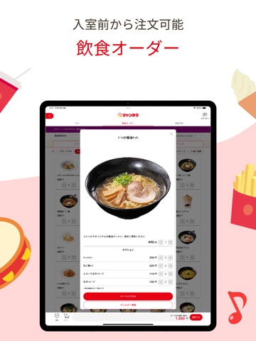

Icon palette
About this app
カラオケならジャンカラ!クーポン・割引&予約・入室・精算がスマホで完結 【受付不要・待ち時間ゼロ!カラオケ予約から入室・精算までスマホひとつで】 大阪、京都、兵庫、名古屋、福岡など、西日本を中心に200店舗以上展開する「ジャンカラ(Jankara)」の公式アプリです。 無料会員登録(最短1分)するだけで、平均24%OFFでご利用いただけます。 また、近くのカラオケ店舗の検索・予約・入室・お会計まで、すべてスマホひとつで完結します。 さらにアプリ会員限定のカラオケ割引クーポンも随時配信中!一人カラオケ(ヒトカラ)から大人数での利用まで、いつでもお得にカラオケを楽しめます。 【ジャンカラアプリでできること】 ・店舗検索:現在地から近くの店舗をマップですぐに検索 ・予約:当日予約も後日の予約も数タップで完了 ・クーポン配信:アプリ会員限定のお得なカラオケ割引クーポンを定期配信 ・PUSH通知:期間限定キャンペーン・会員限定イベント情報をタイムリーにお届け 【すぐカラ:受付不要でお部屋へ直行できるジャンカラ独自機能】 ・ …
App details
What you can learn from カラオケ ジャンカラ
Every shipping app on the App Store has gone through the same decisions you're working through right now: which screenshot goes first, what caption sits over it, which device frame to show, what color the background should be. The 14 screenshots above are カラオケ ジャンカラ's answers to those questions — they're public, they're real, and they made it through Apple's review.
What the numbers say: カラオケ ジャンカラ runs a mixed light-and-dark set where the background shifts from screenshot to screenshot (first shot #E40414) — each image has to stand on its own, so the captions carry more of the story. The accent colour we picked up, #FCF464, is the one to reuse for badges, arrows and highlighted words if you borrow this look. Hit Use this style to open the editor with these exact colours and drop your own screenshot in.
Notice the first screenshot in particular. It's the one users see in search results and on the product page, and it's where most apps spend their best caption and tightest design. Look at the proportion of background to phone, where the text sits, what one thing the image is trying to communicate.
Want to see how other Lifestyle apps approach the same problem? Browse more Lifestyle apps in the showcase.
Take what works into your own screenshots
Open LaunchShots and design your App Store & Google Play screenshots — pick a device frame, drop captions, ship in minutes. Free, in your browser.
Open the screenshot editor →Apps with a similar look
Closest background + accent colours among the listings we've analysed — useful when you want to see the same palette handled by a different team.