Screenshot style breakdown
Sampled from 6 of L'Indépendant, Actus locales's App Store screenshots — background, accent and theme, measured by LaunchShots (not something Apple publishes).
#F4CC4C bg
#D6B342
#046CBC accent
#111111 text
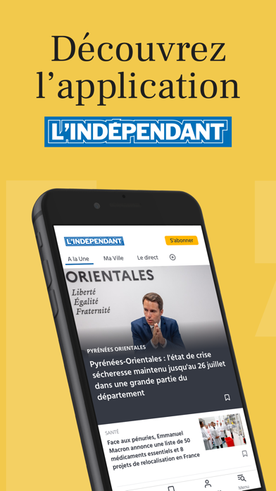
- #1Découvrez l’application
- #2Une rédaction au coeur de l'actualité locale, nationale et internationale
- #3Toutes les infos de votre ville ou commune ( de votre choix
- #4Retrouvez facilement tous vos articles favoris
- #5Personnalisez votre fil d'actualité
- #6Abonnez-vous pour accéder a tous les articles sans pub
Captions read from the screenshots (OCR, may contain small errors): 6 headlines, 7.2 words on average (longest 12).
Screenshots


iPad screenshots


Icon palette
About this app
La référence de l’info locale dans l’Aude et les Pyrénées-Orientales. Notre mission : vous informer de ce qui se passe près de chez vous, mais aussi en France et dans le monde. LE QUOTIDIEN NUMERO 1 DANS L’AUDE ET LES PYRENEES-ORIENTALES Retrouvez toute l’info de votre territoire sur l’Aude et les Pyrénées-Orientales: - Une couverture au quotidien de l’actualité de nos villages - Des alertes infos pour être informés des sujets importants - Infos, politique, justice, éducation… accédez à vos rubriques préférées - Des podcasts dédiés Géolocalisez-vous et suivez l’information près de chez vous : Perpignan, Narbonne, Carcassonne et plus de 659 communes. DES SERVICES ADAPTES A VOTRE QUOTIDIEN - Les prévisions météo détaillées par commune - L’agenda des sorties par ville pour trouver facilement des idées d’activités - Avis de décès pour consulter facilement les avis d’obsèques et remerci…
App details
What you can learn from L'Indépendant, Actus locales
Every shipping app on the App Store has gone through the same decisions you're working through right now: which screenshot goes first, what caption sits over it, which device frame to show, what color the background should be. The 20 screenshots above are L'Indépendant, Actus locales's answers to those questions — they're public, they're real, and they made it through Apple's review.
What the numbers say: L'Indépendant, Actus locales runs a light set where the background shifts from screenshot to screenshot (first shot #F4CC4C) — each image has to stand on its own, so the captions carry more of the story. The accent colour we picked up, #046CBC, is the one to reuse for badges, arrows and highlighted words if you borrow this look. Hit Use this style to open the editor with these exact colours and drop your own screenshot in.
Notice the first screenshot in particular. It's the one users see in search results and on the product page, and it's where most apps spend their best caption and tightest design. Look at the proportion of background to phone, where the text sits, what one thing the image is trying to communicate.
Want to see how other News apps approach the same problem? Browse more News apps in the showcase.
Take what works into your own screenshots
Open LaunchShots and design your App Store & Google Play screenshots — pick a device frame, drop captions, ship in minutes. Free, in your browser.
Open the screenshot editor →Apps with a similar look
Closest background + accent colours among the listings we've analysed — useful when you want to see the same palette handled by a different team.