Chart position — tracked daily by LaunchShots
Screenshot style breakdown
Sampled from 6 of Fishbox - スマート釣りアプリ's App Store screenshots — background, accent and theme, measured by LaunchShots (not something Apple publishes).
#FCFCFC bg
#DDDDDD
#44B4C4 accent
#111111 text
Screenshots




Icon palette
About this app
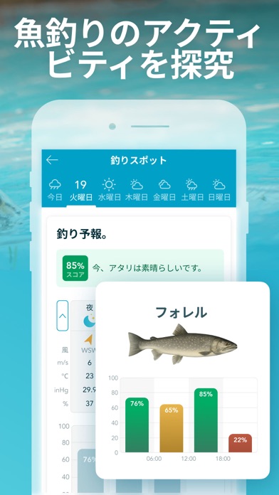
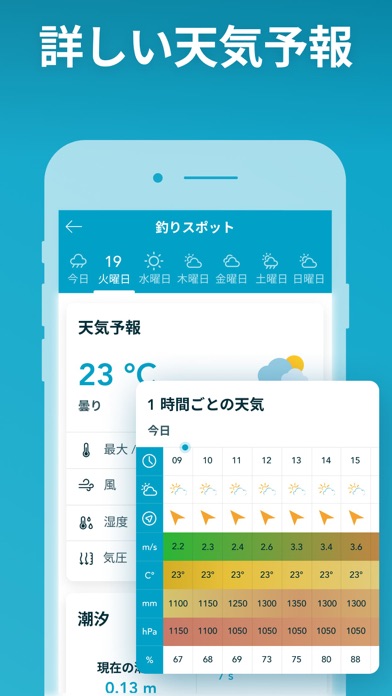
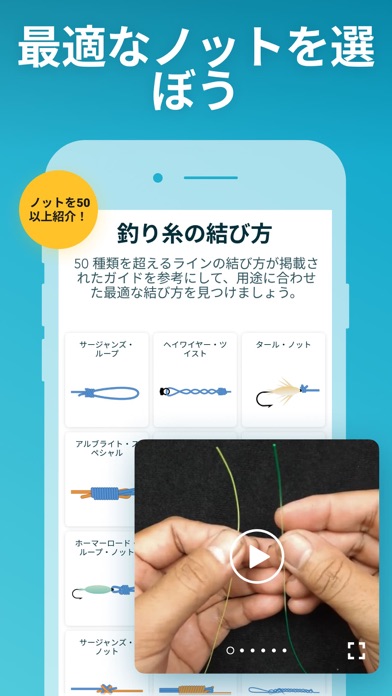
最も正確な釣りの最適時間予報、近くのおすすめ釣りスポット、潮汐チャート、ソルナー、海図、トップノットのビデオガイドをすべて一つのアプリで。 釣りの準備に必要なすべてが揃っています。新しい釣り場を探す時間を減らし、魚が食いつかない理由を理解し、釣果のチャンスを高めよう。 今すぐFishboxに参加して、釣果を最大化する方法を見つけよう。淡水、海水問わず、世界中の釣り人に最適なアプリです。Fishboxアプリを無料でダウンロードしよう! 最適なタイミングで釣りに出よう! - Fishboxの釣り予報で、最高の釣り時間を逃さずに! • Fishbox独自のアルゴリズムが、魚の行動に影響を与える41の気象パラメーターを分析し、最適な釣り時間をリアルタイムで予測 • 魚が食いつかない理由を表示 • 20年以上の経験を持つ魚類学者やプロの釣り師と共同開発 • 最も正確な気象データを使用 • 世界中のあらゆる水域で利用可能 • 地元の釣り人によって検証済み 釣りの旅行を事前に計画しよう! - 釣りの計画に必要なすべてのデータを入手し、変化する天候をチェッ…
App details
What you can learn from Fishbox - スマート釣りアプリ
Every shipping app on the App Store has gone through the same decisions you're working through right now: which screenshot goes first, what caption sits over it, which device frame to show, what color the background should be. The 8 screenshots above are Fishbox - スマート釣りアプリ's answers to those questions — they're public, they're real, and they made it through Apple's review.
What the numbers say: Fishbox - スマート釣りアプリ runs a mixed light-and-dark set where the background shifts from screenshot to screenshot (first shot #FCFCFC) — each image has to stand on its own, so the captions carry more of the story. The accent colour we picked up, #44B4C4, is the one to reuse for badges, arrows and highlighted words if you borrow this look. Hit Use this style to open the editor with these exact colours and drop your own screenshot in.
Notice the first screenshot in particular. It's the one users see in search results and on the product page, and it's where most apps spend their best caption and tightest design. Look at the proportion of background to phone, where the text sits, what one thing the image is trying to communicate.
Want to see how other Sports apps approach the same problem? Browse more Sports apps in the showcase.
Take what works into your own screenshots
Open LaunchShots and design your App Store & Google Play screenshots — pick a device frame, drop captions, ship in minutes. Free, in your browser.
Open the screenshot editor →Apps with a similar look
Closest background + accent colours among the listings we've analysed — useful when you want to see the same palette handled by a different team.