Chart position — tracked daily by LaunchShots
Screenshot style breakdown
Sampled from 5 of ココシル's App Store screenshots — background, accent and theme, measured by LaunchShots (not something Apple publishes).
#FCFCFC bg
#DDDDDD
#04B404 accent
#111111 text
Screenshots


iPad screenshots

Icon palette
About this app
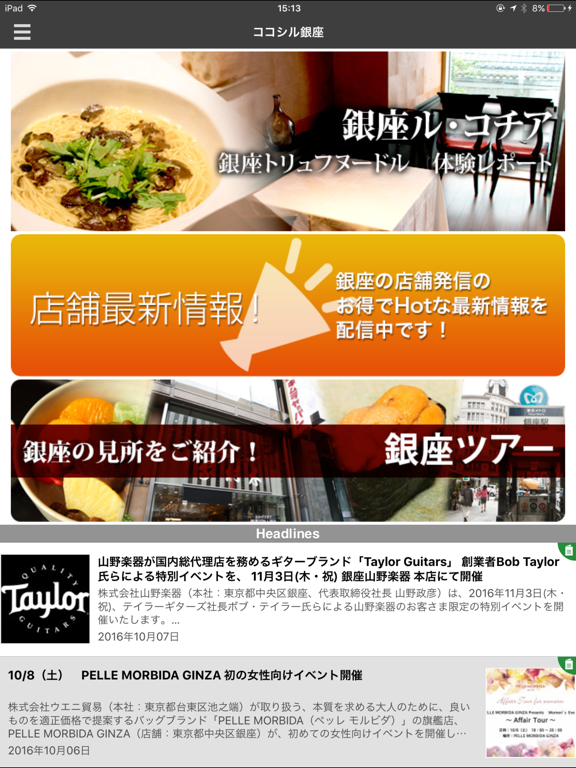
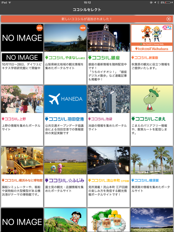
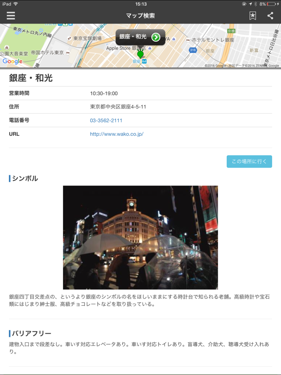
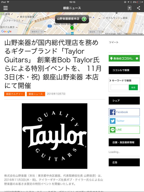
**ココシルは、観光地・街・博物館・美術館など、さまざまな場所でまち歩きを楽しむアプリです** **「まち」の観光施設、店舗などの情報、地域ならでは特色あるとっておき情報、イベント、ニュース、季節の見どころなどの情報が満載!** **日本国内50地域、海外1地域で利用できます(2018年6月現在) **「観光アプリ」「観光パスポート」「まち歩きアプリ」「自治体総合アプリ」「博物館・美術館展示案内アプリ」などとして使えます** **ココシル導入事例(順不同) 銀座/こまえ/会津若松七日町/那須塩原/大仙公園日本庭園/横浜みなと博物館/池袋/横須賀/上野/南足柄/八丈島/秋葉原/いわて国体ナビ/札幌/湯河原/白岡/津山/流山本町江戸回廊/ふじみ/塩谷/ふくおかよかとこパスポート/やまなしin峡北/ひょうご北摂ライフ/こまえくぼ1234/和気町/いすみ/大和高田市市民交流センターコスモスプラザ/大和郡山城下町/たわらもと/王寺町観光協会/京都・山城/赤い風船/恩納村/心にググっとぐんまちゃんパスポート/わ!しながわ巡り/あいら鹿児島/狛江市医療・介護・地域資源マ…
App details
What you can learn from ココシル
Every shipping app on the App Store has gone through the same decisions you're working through right now: which screenshot goes first, what caption sits over it, which device frame to show, what color the background should be. The 10 screenshots above are ココシル's answers to those questions — they're public, they're real, and they made it through Apple's review.
What the numbers say: ココシル runs a mixed light-and-dark set where the background shifts from screenshot to screenshot (first shot #FCFCFC) — each image has to stand on its own, so the captions carry more of the story. The accent colour we picked up, #04B404, is the one to reuse for badges, arrows and highlighted words if you borrow this look. Hit Use this style to open the editor with these exact colours and drop your own screenshot in.
Notice the first screenshot in particular. It's the one users see in search results and on the product page, and it's where most apps spend their best caption and tightest design. Look at the proportion of background to phone, where the text sits, what one thing the image is trying to communicate.
Want to see how other Travel apps approach the same problem? Browse more Travel apps in the showcase.
Take what works into your own screenshots
Open LaunchShots and design your App Store & Google Play screenshots — pick a device frame, drop captions, ship in minutes. Free, in your browser.
Open the screenshot editor →Apps with a similar look
Closest background + accent colours among the listings we've analysed — useful when you want to see the same palette handled by a different team.