Chart position — tracked daily by LaunchShots
Screenshot style breakdown
Sampled from 4 of Đọc Báo Pega's App Store screenshots — background, accent and theme, measured by LaunchShots (not something Apple publishes).
#040404 bg
#272727
#5C7444 accent
#FFFFFF text
Screenshots
Icon palette
About this app
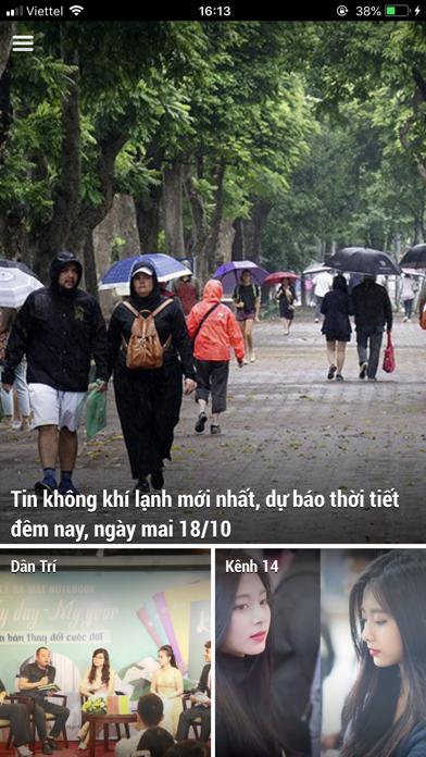
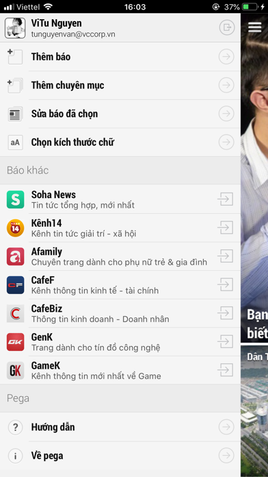
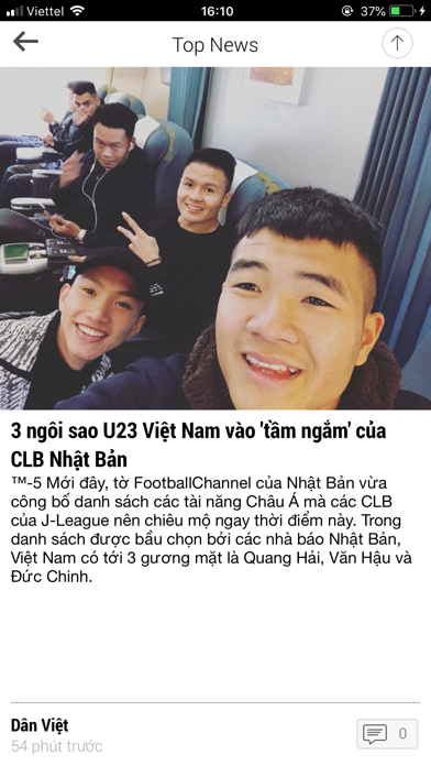
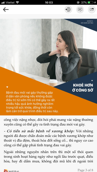
Pega là ứng dụng đọc báo với trải nghiệm đọc trên mobile hoàn toàn mới, không giống như các app đọc báo trước đây. Với app đọc báo này các bạn sẽ tiết kiệm được rất nhiều thời gian cho việc cập nhật tin tức qua các tờ báo, nhất là đối với những người có thói quen đọc nhiều tờ báo một lúc trên PC. Nội dung tin cung cấp cho app đã được nội ngũ biên tập viên biên tập lại để dễ đọc, phù hợp với mobile và tin tức sẽ được cập nhật liên tục. Hiện tại app đã tích hợp hơn 200+ đầu báo gồm: Dân Trí, Kênh 14, Afamily, CafeF, CafeBiz, AutoPro, GenK, GameK, SohaNews, VnEconomy, Vnexpress, 24H, Ngôi Sao, Người Lao Động, Tuổi Trẻ, Vietnamnet, LinkHay, Thanh Niên, Lao Động, VietNam Plus, Tiền Phong, Tinh tế, Số hoá, Thông tin công nghệ, Bóng đá, Thể thao, Web trẻ thơ, Làm cha mẹ, Đẹp... Các chức năng chính của ứng dụng Pega: 1. Đọc báo 2. Có thể thêm, xóa các báo. 3. Thêm xóa chuyên mục của …
App details
What you can learn from Đọc Báo Pega
Every shipping app on the App Store has gone through the same decisions you're working through right now: which screenshot goes first, what caption sits over it, which device frame to show, what color the background should be. The 4 screenshots above are Đọc Báo Pega's answers to those questions — they're public, they're real, and they made it through Apple's review.
What the numbers say: Đọc Báo Pega runs a mixed light-and-dark set where the background shifts from screenshot to screenshot (first shot #040404) — each image has to stand on its own, so the captions carry more of the story. The accent colour we picked up, #5C7444, is the one to reuse for badges, arrows and highlighted words if you borrow this look. Hit Use this style to open the editor with these exact colours and drop your own screenshot in.
Notice the first screenshot in particular. It's the one users see in search results and on the product page, and it's where most apps spend their best caption and tightest design. Look at the proportion of background to phone, where the text sits, what one thing the image is trying to communicate.
Want to see how other News apps approach the same problem? Browse more News apps in the showcase.
Take what works into your own screenshots
Open LaunchShots and design your App Store & Google Play screenshots — pick a device frame, drop captions, ship in minutes. Free, in your browser.
Open the screenshot editor →Apps with a similar look
Closest background + accent colours among the listings we've analysed — useful when you want to see the same palette handled by a different team.