Chart position — tracked daily by LaunchShots
Screenshot changes — detected by LaunchShots
Screenshot style breakdown
Sampled from 6 of YAMAP / ヤマップ 登山地図アプリ's App Store screenshots — background, accent and theme, measured by LaunchShots (not something Apple publishes).
#ACCCF4 bg
#97B3D6
#5C9CBC accent
#111111 text
Screenshots


Icon palette
About this app
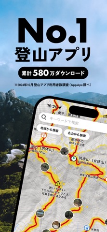
Q:登山アプリのYAMAPを使うと、なぜ安心安全に登山できるのでしょうか。 A:YAMAPは、事前に地図をダウンロードして使います。これによって、電波が届かない、または弱い山中でもスマートフォン内蔵GPSを使って現在地を正確に把握でき、道迷いリスクが格段に減ります。 YAMAPの地図は、国土地理院のデータを活用しており、詳細な登山道がわかり、自分の居場所や進むべき道がすぐ、高精度にわかります。 Q:遭難したときに救助に役立つというのは、本当ですか? A:YAMAPは自分の現在地がわかるだけでなく、実際に歩いた軌跡のデータから、連携している警察や消防などが捜索の範囲を絞り、救助できた事例が多くあります。 たとえ、ログがなくても、遭難者が直前にダウンロードした地図や、閲覧していた他のユーザーの活動日記(記録)を手がかりに救助された事例もあります。 Q:なぜ利用者数の多い登山アプリがいいのですか? A:YAMAPは累計580万ダウンロード(2026年8月時点)で、登山アプリ利用者数はNo.1(2024年10月 App Ape調べ)です。すれ違ったYAMAPユ…
App details
What you can learn from YAMAP / ヤマップ 登山地図アプリ
Every shipping app on the App Store has gone through the same decisions you're working through right now: which screenshot goes first, what caption sits over it, which device frame to show, what color the background should be. The 8 screenshots above are YAMAP / ヤマップ 登山地図アプリ's answers to those questions — they're public, they're real, and they made it through Apple's review.
What the numbers say: YAMAP / ヤマップ 登山地図アプリ runs a mixed light-and-dark set where the background shifts from screenshot to screenshot (first shot #ACCCF4) — each image has to stand on its own, so the captions carry more of the story. The accent colour we picked up, #5C9CBC, is the one to reuse for badges, arrows and highlighted words if you borrow this look. Hit Use this style to open the editor with these exact colours and drop your own screenshot in.
Notice the first screenshot in particular. It's the one users see in search results and on the product page, and it's where most apps spend their best caption and tightest design. Look at the proportion of background to phone, where the text sits, what one thing the image is trying to communicate.
Want to see how other Sports apps approach the same problem? Browse more Sports apps in the showcase.
Take what works into your own screenshots
Open LaunchShots and design your App Store & Google Play screenshots — pick a device frame, drop captions, ship in minutes. Free, in your browser.
Open the screenshot editor →Apps with a similar look
Closest background + accent colours among the listings we've analysed — useful when you want to see the same palette handled by a different team.