Chart position — tracked daily by LaunchShots
Screenshot changes — detected by LaunchShots
Screenshot style breakdown
Sampled from 6 of auナビウォーク's App Store screenshots — background, accent and theme, measured by LaunchShots (not something Apple publishes).
#FCFCFC bg
#DDDDDD
#FCD434 accent
#111111 text
Reading the caption text from the screenshots in your browser…
Screenshots
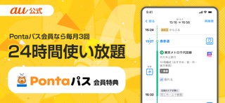
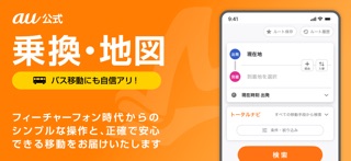

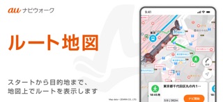


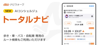


iPad screenshots


Icon palette
About this app
「auナビウォーク」は、あなたの移動に最適なルートを検索して、初めての場所でも安心して目的地に移動できるアプリです。 サービス提供から20周年以降も、誰でも安心して乗換案内や、バス・新幹線・車ルートなどの移動に役立つ機能を提供いたします。 【すぐに使える主な機能】 ■乗換案内 ・早い、安い、乗換少ないルートの表示 ・乗車ホーム番号の表示 ・乗換に最適な乗車位置表示 ・駅出口番号/出口からの方向表示 ・エレベーター/エスカレーター優先検索 ・新幹線、特急利用などの条件設定 ・5本前・後のルート検索 ・ルート画像の保存やカレンダーへの登録 ・URLでのルート共有 ・寝過ごし防止のアラーム機能 ■時刻表 ・電車・バス・新幹線・フェリー・飛行機の時刻表を検索できます ・年末年始などの臨時ダイヤの全国対応 ・全国の路線バス・コミュニティーバスも100%完備しております。 ■店舗/施設の検索 ・独自収集された全国700万件以上のスポット検索 ・地図でスポットのアイコンをタップすることで施設情報が表示可能 ・お店の場所、開店時間などの詳…
App details
What you can learn from auナビウォーク
Every shipping app on the App Store has gone through the same decisions you're working through right now: which screenshot goes first, what caption sits over it, which device frame to show, what color the background should be. The 16 screenshots above are auナビウォーク's answers to those questions — they're public, they're real, and they made it through Apple's review.
What the numbers say: auナビウォーク runs a light set where the background shifts from screenshot to screenshot (first shot #FCFCFC) — each image has to stand on its own, so the captions carry more of the story. The accent colour we picked up, #FCD434, is the one to reuse for badges, arrows and highlighted words if you borrow this look. Hit Use this style to open the editor with these exact colours and drop your own screenshot in.
Notice the first screenshot in particular. It's the one users see in search results and on the product page, and it's where most apps spend their best caption and tightest design. Look at the proportion of background to phone, where the text sits, what one thing the image is trying to communicate.
Want to see how other Navigation apps approach the same problem? Browse more Navigation apps in the showcase.
Take what works into your own screenshots
Open LaunchShots and design your App Store & Google Play screenshots — pick a device frame, drop captions, ship in minutes. Free, in your browser.
Open the screenshot editor →Apps with a similar look
Closest background + accent colours among the listings we've analysed — useful when you want to see the same palette handled by a different team.