Screenshot style breakdown
Sampled from 5 of 骑行控 - 跑步骑行运动记录's App Store screenshots — background, accent and theme, measured by LaunchShots (not something Apple publishes).
#242424 bg
#424242
#24C494 accent
#FFFFFF text
Screenshots



Icon palette
About this app
*** App Store 首页推荐,持续开发十年,最佳骑行应用 *** 「骑行控」——简约而不简单,极简骑行记录应用,无广告,无社交。 「骑行控」由一群爱好骑行的年轻人开发,有了她,你可以: 记录——记录每次骑行的里程、热量、极速、均速等信息,休息时还会自动暂停哦; 分享——通过微博、微信等方式将你的骑行记录分享给好友; 云端——云端存储,您再也不用担心骑行记录丢失啦; Apple Health——如你同意并授权,结束骑行后,App 会将骑行数据同步到苹果「健康」App 赶紧邀请你的好友一起骑行吧。 没有发令枪,只要一辆车; 没有闪光灯,只要一壶水; 没有终点线,一直在路上。 注意:持续运行GPS,耗电量会显著增加。 新浪微博: @骑行控 微信公众帐号:@骑行控 用户协议: https://iblacksun.github.io/ridecon/useragreement.html 隐私协议: https://iblacksun.github.io/ridecon/agreement.html
App details
What you can learn from 骑行控 - 跑步骑行运动记录
Every shipping app on the App Store has gone through the same decisions you're working through right now: which screenshot goes first, what caption sits over it, which device frame to show, what color the background should be. The 5 screenshots above are 骑行控 - 跑步骑行运动记录's answers to those questions — they're public, they're real, and they made it through Apple's review.
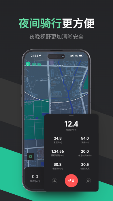
What the numbers say: 骑行控 - 跑步骑行运动记录 runs a dark set where the background shifts from screenshot to screenshot (first shot #242424) — each image has to stand on its own, so the captions carry more of the story. The accent colour we picked up, #24C494, is the one to reuse for badges, arrows and highlighted words if you borrow this look. Hit Use this style to open the editor with these exact colours and drop your own screenshot in.
Notice the first screenshot in particular. It's the one users see in search results and on the product page, and it's where most apps spend their best caption and tightest design. Look at the proportion of background to phone, where the text sits, what one thing the image is trying to communicate.
Want to see how other Sports apps approach the same problem? Browse more Sports apps in the showcase.
Take what works into your own screenshots
Open LaunchShots and design your App Store & Google Play screenshots — pick a device frame, drop captions, ship in minutes. Free, in your browser.
Open the screenshot editor →Apps with a similar look
Closest background + accent colours among the listings we've analysed — useful when you want to see the same palette handled by a different team.