Chart position — tracked daily by LaunchShots
Screenshot changes — detected by LaunchShots
Screenshot style breakdown
Sampled from 4 of 肯德基KFC(官方版)'s App Store screenshots — background, accent and theme, measured by LaunchShots (not something Apple publishes).
#FCFCFC bg
#DDDDDD
#F49CAC accent
#111111 text
Screenshots

Icon palette
About this app
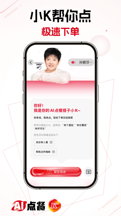
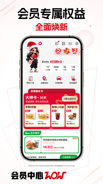
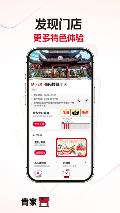
【肯德基超级APP】 丰富体验,WOW会员逛吃更尽兴! 【体验AI点餐】 - 往常爱点的早餐,无需开口,小K极速智能推送 - 纠结吃什么?把思考交给小K,帮你推荐多套专属方案 - 聚会点餐不用愁,人数口味告诉小K,一桌美味全配齐 【APP爆红包更划算】 - 每月20号爆开心,来肯德基APP,最高20元红包等你来爆! - 红包天天爆,下单直接抵扣,天天都能省~ 【WOW会员专属阵地】 - 会员权益焕新,超多摩登造型和成就勋章等你解锁! - 开通肯德基大神卡,多重好礼一卡拿捏,全天随时省! - 安装明星日历小组件,让TA在桌面陪伴你每一天。 更多精彩,尽在肯德基APP会员中心! 【肯家服务聚集地】 - 一站式GET门店特色服务,挚友生日霸屏、IP主题活动、……还有超多惊喜等你探索! 【发现更多优惠】 - 疯狂星期四:周四上APP,多款美味一步到“胃”! - 周末疯狂拼:周末上APP,到店专享8件49.9元!还有机会赢取惊喜大奖!
App details
What you can learn from 肯德基KFC(官方版)
Every shipping app on the App Store has gone through the same decisions you're working through right now: which screenshot goes first, what caption sits over it, which device frame to show, what color the background should be. The 4 screenshots above are 肯德基KFC(官方版)'s answers to those questions — they're public, they're real, and they made it through Apple's review.
What the numbers say: 肯德基KFC(官方版) runs a light set with one background colour (#FCFCFC) carried across every screenshot — the listing reads as a single poster when the shots sit side by side in search results. The accent colour we picked up, #F49CAC, is the one to reuse for badges, arrows and highlighted words if you borrow this look. Hit Use this style to open the editor with these exact colours and drop your own screenshot in.
Notice the first screenshot in particular. It's the one users see in search results and on the product page, and it's where most apps spend their best caption and tightest design. Look at the proportion of background to phone, where the text sits, what one thing the image is trying to communicate.
Want to see how other Food & Drink apps approach the same problem? Browse more Food & Drink apps in the showcase.
Take what works into your own screenshots
Open LaunchShots and design your App Store & Google Play screenshots — pick a device frame, drop captions, ship in minutes. Free, in your browser.
Open the screenshot editor →Apps with a similar look
Closest background + accent colours among the listings we've analysed — useful when you want to see the same palette handled by a different team.