Chart position — tracked daily by LaunchShots
Screenshot style breakdown
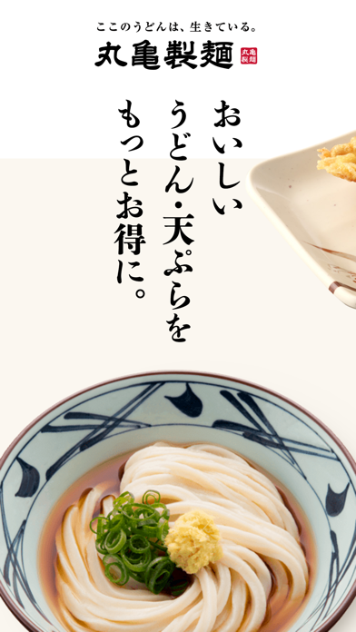
Sampled from 6 of 丸亀製麺's App Store screenshots — background, accent and theme, measured by LaunchShots (not something Apple publishes).
#FCFCFC bg
#DDDDDD
#B46C54 accent
#111111 text
Screenshots




Icon palette
About this app
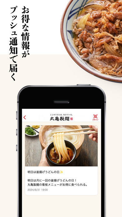
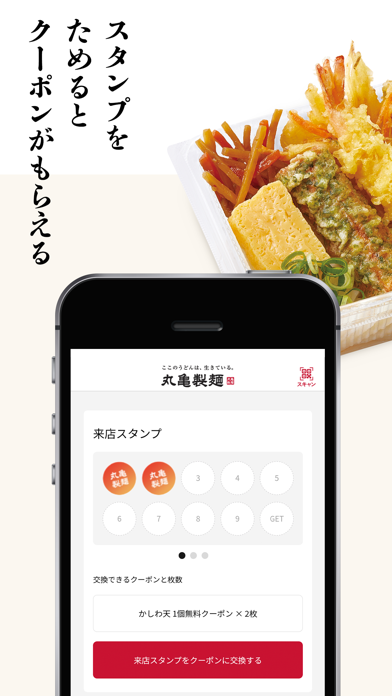
◇初回ダウンロードの方に【商品割引クーポン】プレゼント中◇ 丸亀製麺アプリは、お得なクーポンや新商品情報を無料でお届けします。「打ち立て・できたて」にこだわった丸亀製麺の本場讃岐うどんを、アプリを使ってお得にお楽しみください。 クーポン 丸亀製麺で使える、お得なクーポンをお届けします。会計時、画面に表示したQRコードをレジにてご提示ください。 来店スタンプ お会計ごと(レシートスキャン、もしくはクーポン利用ごと)に貯まる来店スタンプを10個集めると、お得なクーポンと交換できます。 スキャン 丸亀製麺のレシートのQRコードを読み込む機能です。レシートスキャンごとに、来店スタンプが貯まります。 メニュー 丸亀製麺のメニューを確認できます。店内メニュー、お持ち帰りメニューがございます。 店舗検索 端末の現在地から最寄りの店舗を検索し、いつでも丸亀製麺を探すことができます。都道府県から探すことも可能です。 おすすめ・限定メニュー 期間限定メニュー、フェア情報を表示します。 プッシュ通知機能 丸亀製麺の最新情報…
App details
What you can learn from 丸亀製麺
Every shipping app on the App Store has gone through the same decisions you're working through right now: which screenshot goes first, what caption sits over it, which device frame to show, what color the background should be. The 7 screenshots above are 丸亀製麺's answers to those questions — they're public, they're real, and they made it through Apple's review.
What the numbers say: 丸亀製麺 runs a light set with one background colour (#FCFCFC) carried across every screenshot — the listing reads as a single poster when the shots sit side by side in search results. The accent colour we picked up, #B46C54, is the one to reuse for badges, arrows and highlighted words if you borrow this look. Hit Use this style to open the editor with these exact colours and drop your own screenshot in.
Notice the first screenshot in particular. It's the one users see in search results and on the product page, and it's where most apps spend their best caption and tightest design. Look at the proportion of background to phone, where the text sits, what one thing the image is trying to communicate.
Want to see how other Food & Drink apps approach the same problem? Browse more Food & Drink apps in the showcase.
Take what works into your own screenshots
Open LaunchShots and design your App Store & Google Play screenshots — pick a device frame, drop captions, ship in minutes. Free, in your browser.
Open the screenshot editor →Apps with a similar look
Closest background + accent colours among the listings we've analysed — useful when you want to see the same palette handled by a different team.