Chart position — tracked daily by LaunchShots
Screenshot style breakdown
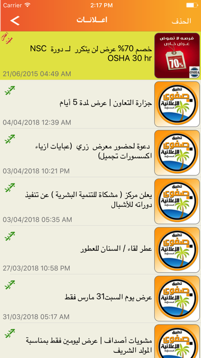
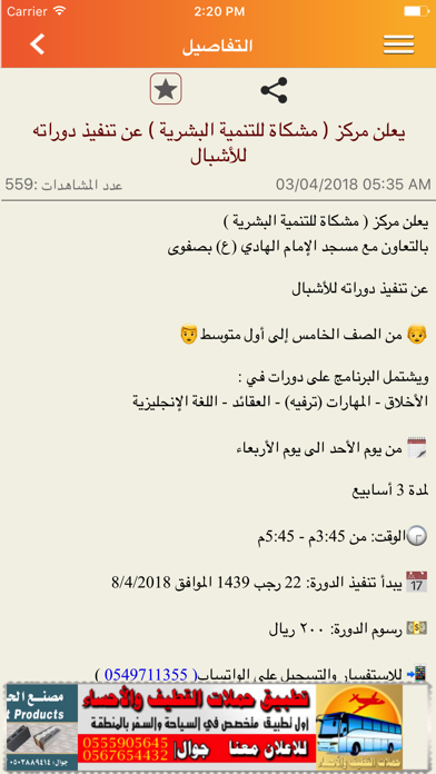
Sampled from 6 of صفوى الإعلانية's App Store screenshots — background, accent and theme, measured by LaunchShots (not something Apple publishes).
#FCA40C bg
#DD900A
#FCDC9C accent
#111111 text
Screenshots





Icon palette
About this app
تطبيق صفوى للجميع وليس لصفوى فقط فصفوى الاعلانية من أول يوم لانطلاقها كان توجهها خدمة جميع المناطق دون الاقتصار على اسم التطبيق (صفوى الاعلانية) حيث كان لتوجهنا هذا وخدمتكم عبر الاعلانات الالكترونية أثرٌ قوي في تحقيق قاعدة جماهيرية قوية من مختلف مناطق المملكة وخارج المملكة كذلك ، حيث يتابعنا اليوم عشرات آللآف من الناس عبر جوالاتهم الذكية -وقد صممنا البرنامج ليقدم إعلاناته الاجتماعية والتجارية في آنٍ واحد لجميع مدن القطيف والأحساء والدمام والخبر شمولية الاعلان: يشمل على نشر إعلاناتكم عن جميع المنتجات وعلى سبيل المثال :- اعلانات التموينات الغذائية اعلانات المطاعم السيارات والأجهزة الكهربائية والالكترونية والادوات الصحية والسفر والسياحة واعلانات الأفراد والوفيات والتسلية والترفيه والمناسبات الدينية والفعليات الاجتماعية وقاعدة ارقام هامة . فقد حرصنا على أن يكون تطبيقكم يجمع بين الفائدة الثقافية والتجارية لتلائم رغباتكم واهتمامكم حتى يلبي حاجاتكم، لتتعرف أكثر على تطبيقكم…
App details
What you can learn from صفوى الإعلانية
Every shipping app on the App Store has gone through the same decisions you're working through right now: which screenshot goes first, what caption sits over it, which device frame to show, what color the background should be. The 7 screenshots above are صفوى الإعلانية's answers to those questions — they're public, they're real, and they made it through Apple's review.
What the numbers say: صفوى الإعلانية runs a light set where the background shifts from screenshot to screenshot (first shot #FCA40C) — each image has to stand on its own, so the captions carry more of the story. The accent colour we picked up, #FCDC9C, is the one to reuse for badges, arrows and highlighted words if you borrow this look. Hit Use this style to open the editor with these exact colours and drop your own screenshot in.
Notice the first screenshot in particular. It's the one users see in search results and on the product page, and it's where most apps spend their best caption and tightest design. Look at the proportion of background to phone, where the text sits, what one thing the image is trying to communicate.
Want to see how other News apps approach the same problem? Browse more News apps in the showcase.
Take what works into your own screenshots
Open LaunchShots and design your App Store & Google Play screenshots — pick a device frame, drop captions, ship in minutes. Free, in your browser.
Open the screenshot editor →Apps with a similar look
Closest background + accent colours among the listings we've analysed — useful when you want to see the same palette handled by a different team.