Screenshot style breakdown
Sampled from 5 of Calculadora de la ovulación.'s App Store screenshots — background, accent and theme, measured by LaunchShots (not something Apple publishes).
#9CDCFC bg
#89C1DD
#FC94A4 accent
#111111 text
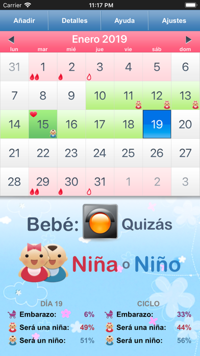
- #1< Enero 2019 > Jun mar mié jue vie sáb dom
- #4FECHA 15 de enero DETALLES
- #5SEGURIDAD Contrasefia DURACION
Captions read from the screenshots (OCR, may contain small errors): 3 headlines, 6.3 words on average (longest 11).
Screenshots



iPad screenshots


Icon palette
About this app
Descubre el ritmo de tu cuerpo con un rastreador de fertilidad basado en la ciencia, diseñado para ayudarte a planificar o evitar el embarazo de manera natural. Solo ingresa el primer día de tu último período, y la app predecirá tu próximo período, el día de ovulación, y los días más y menos fértiles de tu ciclo. Con la sincronización de Apple Health, tus datos se actualizan automáticamente en todos tus dispositivos Apple — para que tus conocimientos sobre fertilidad siempre estén contigo. * Métodos Respaldados Científicamente * Nuestra app incluye dos métodos de predicción del género del bebé: • Método Popular – un enfoque teórico basado en la conocida teoría de Landrum Shettles, que sugiere que el momento dentro de la ventana fértil puede influir en el género del bebé. • Método Científico – un enfoque estadístico basado en investigaciones, desarrollado por Rodrigo Guerrero, sustenta…
App details
What you can learn from Calculadora de la ovulación.
Every shipping app on the App Store has gone through the same decisions you're working through right now: which screenshot goes first, what caption sits over it, which device frame to show, what color the background should be. The 10 screenshots above are Calculadora de la ovulación.'s answers to those questions — they're public, they're real, and they made it through Apple's review.
What the numbers say: Calculadora de la ovulación. runs a light set where the background shifts from screenshot to screenshot (first shot #9CDCFC) — each image has to stand on its own, so the captions carry more of the story. The accent colour we picked up, #FC94A4, is the one to reuse for badges, arrows and highlighted words if you borrow this look. Hit Use this style to open the editor with these exact colours and drop your own screenshot in.
Notice the first screenshot in particular. It's the one users see in search results and on the product page, and it's where most apps spend their best caption and tightest design. Look at the proportion of background to phone, where the text sits, what one thing the image is trying to communicate.
Want to see how other Medical apps approach the same problem? Browse more Medical apps in the showcase.
Take what works into your own screenshots
Open LaunchShots and design your App Store & Google Play screenshots — pick a device frame, drop captions, ship in minutes. Free, in your browser.
Open the screenshot editor →Apps with a similar look
Closest background + accent colours among the listings we've analysed — useful when you want to see the same palette handled by a different team.