Chart position — tracked daily by LaunchShots
Screenshot style breakdown
Sampled from 5 of Говорящий Джинджер 2's App Store screenshots — background, accent and theme, measured by LaunchShots (not something Apple publishes).
#FCFCFC bg
#DDDDDD
#4CCCFC accent
#111111 text
Screenshots
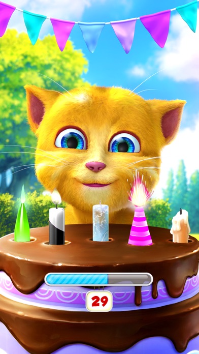
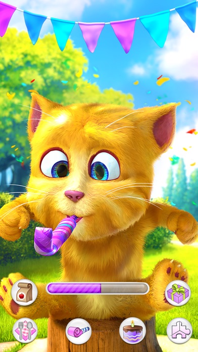
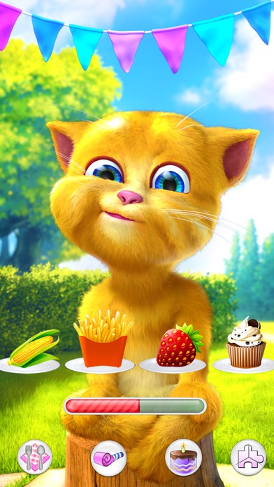
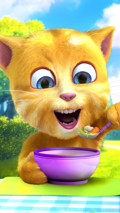
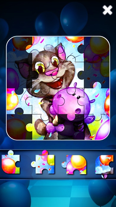
iPad screenshots
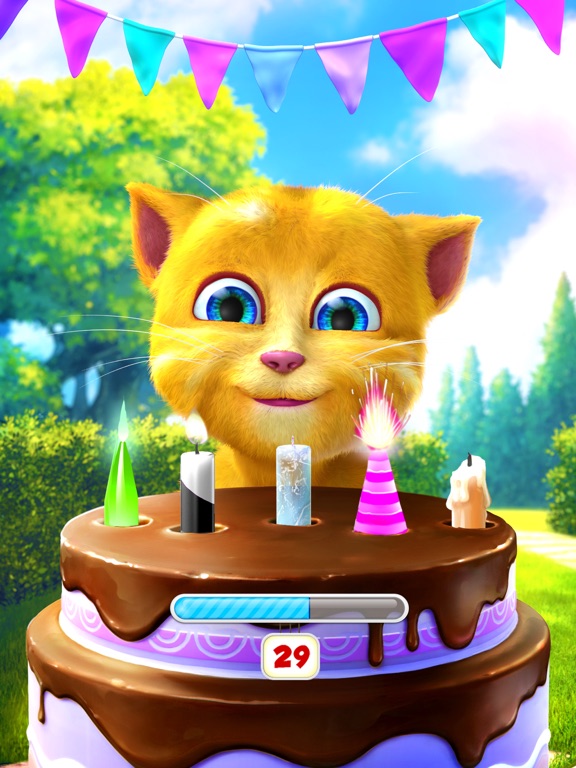
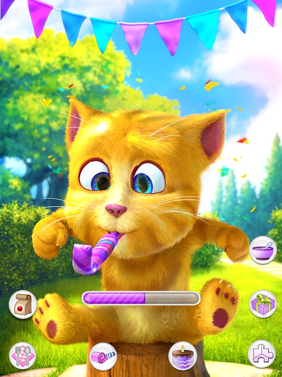
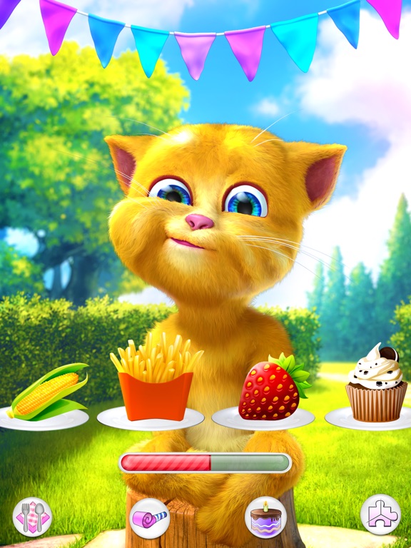
Icon palette
About this app
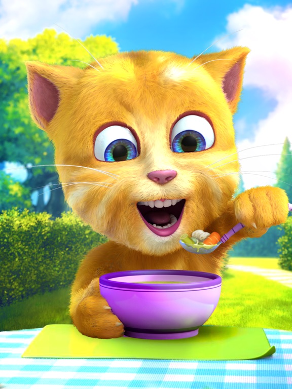
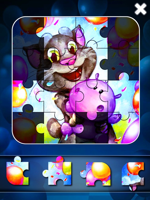
Пришло время позабавиться на праздновании дня рождения! Говорящий Джинджер, самый симпатичный маленький котенок — растет и хочет, чтобы ты отпраздновал вместе с ним его день рождения. :-) Присоединись к нему на самой лучшей вечеринке — с потрясающим угощением и множеством игр! Да, ты приглашен, чтобы провести время с самым чудесным котенком в мире! ФУНКЦИИ: - Говори с Джинджером: говори, и он будет повторять сказанное тобой своим приятным голосом. - Играй с Джинджером: обнимай, щекочи или толкай Джинджера, чтобы увидеть, как он забавно реагирует. - Кушай с Джинджером: корми его закусками или пользуйся специальной кнопкой «время покушать», чтобы поесть вместе с ним. - Снимай Джинджера: снимай видео о том, как забавляется Джинджер, и делись ими со своими друзьями. - Празднуй вместе с Джинджером: дуй в праздничную свистульку, сколько можешь. - Сыграй в мини-игру: посмотри, сколько свече…
App details
What you can learn from Говорящий Джинджер 2
Every shipping app on the App Store has gone through the same decisions you're working through right now: which screenshot goes first, what caption sits over it, which device frame to show, what color the background should be. The 10 screenshots above are Говорящий Джинджер 2's answers to those questions — they're public, they're real, and they made it through Apple's review.
What the numbers say: Говорящий Джинджер 2 runs a mixed light-and-dark set where the background shifts from screenshot to screenshot (first shot #FCFCFC) — each image has to stand on its own, so the captions carry more of the story. The accent colour we picked up, #4CCCFC, is the one to reuse for badges, arrows and highlighted words if you borrow this look. Hit Use this style to open the editor with these exact colours and drop your own screenshot in.
Notice the first screenshot in particular. It's the one users see in search results and on the product page, and it's where most apps spend their best caption and tightest design. Look at the proportion of background to phone, where the text sits, what one thing the image is trying to communicate.
Want to see how other Entertainment apps approach the same problem? Browse more Entertainment apps in the showcase.
Take what works into your own screenshots
Open LaunchShots and design your App Store & Google Play screenshots — pick a device frame, drop captions, ship in minutes. Free, in your browser.
Open the screenshot editor →Apps with a similar look
Closest background + accent colours among the listings we've analysed — useful when you want to see the same palette handled by a different team.