Chart position — tracked daily by LaunchShots
Screenshot changes — detected by LaunchShots
Screenshot style breakdown
Sampled from 3 of マンガボックス 漫画アプリ 人気のマンガ/コミックが読める!'s App Store screenshots — background, accent and theme, measured by LaunchShots (not something Apple publishes).
#74B4C4 bg
#669EAC
#9C544C accent
#111111 text
Screenshots


iPad screenshots


Icon palette
About this app
■□1900万人以上が使うマンガアプリ□■ ・オリジナルのマンガの最新話が無料で読める! ・人気マンガが毎日無料で読める! 【主な連載作品】 ・恋と嘘 ・モンスターの医者 ・インゴシマ ・あおのたつき ・俺んちに来た女騎士と田舎暮らしすることになった件 ・帰ってきた元勇者 ※上記は全てマンガボックスオリジナル作品 など、毎日読める作品は100作品以上! 【マンガボックスの主な特徴】 ◆話題のマンガが毎日読める! マンガボックスでは、 バトル・恋愛・ホラー・ギャグ・サスペンスなどの 様々なジャンルの話題作を 300作品以上のマンガを読むことができます。 マンガボックスだけで最新話を読めるマンガも! ◆有名マンガもマンガボックスで読める! マンガボックスの"ストア"では、 20万冊以上のコミックスを購入できます。 更に、定期的に開催されるキャンペーンを利用すれば 有名マンガをお得に購入できます。 ◆CMを見ればもっとマンガが読める! 連載作品の中には、 CMを見れば、さらに読める作品も。 有名作や映像化作品もラインナップ。 ■□公式からの…
App details
What you can learn from マンガボックス 漫画アプリ 人気のマンガ/コミックが読める!
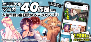
Every shipping app on the App Store has gone through the same decisions you're working through right now: which screenshot goes first, what caption sits over it, which device frame to show, what color the background should be. The 6 screenshots above are マンガボックス 漫画アプリ 人気のマンガ/コミックが読める!'s answers to those questions — they're public, they're real, and they made it through Apple's review.
What the numbers say: マンガボックス 漫画アプリ 人気のマンガ/コミックが読める! runs a mixed light-and-dark set where the background shifts from screenshot to screenshot (first shot #74B4C4) — each image has to stand on its own, so the captions carry more of the story. The accent colour we picked up, #9C544C, is the one to reuse for badges, arrows and highlighted words if you borrow this look. Hit Use this style to open the editor with these exact colours and drop your own screenshot in.
Notice the first screenshot in particular. It's the one users see in search results and on the product page, and it's where most apps spend their best caption and tightest design. Look at the proportion of background to phone, where the text sits, what one thing the image is trying to communicate.
Want to see how other Book apps approach the same problem? Browse more Book apps in the showcase.
Take what works into your own screenshots
Open LaunchShots and design your App Store & Google Play screenshots — pick a device frame, drop captions, ship in minutes. Free, in your browser.
Open the screenshot editor →Apps with a similar look
Closest background + accent colours among the listings we've analysed — useful when you want to see the same palette handled by a different team.