Chart position — tracked daily by LaunchShots
Screenshot style breakdown
Sampled from 6 of FourT Pilates's App Store screenshots — background, accent and theme, measured by LaunchShots (not something Apple publishes).
#FC7CB4 bg
#DD6D9E
#9C6454 accent
#111111 text
Reading the caption text from the screenshots in your browser…
Screenshots


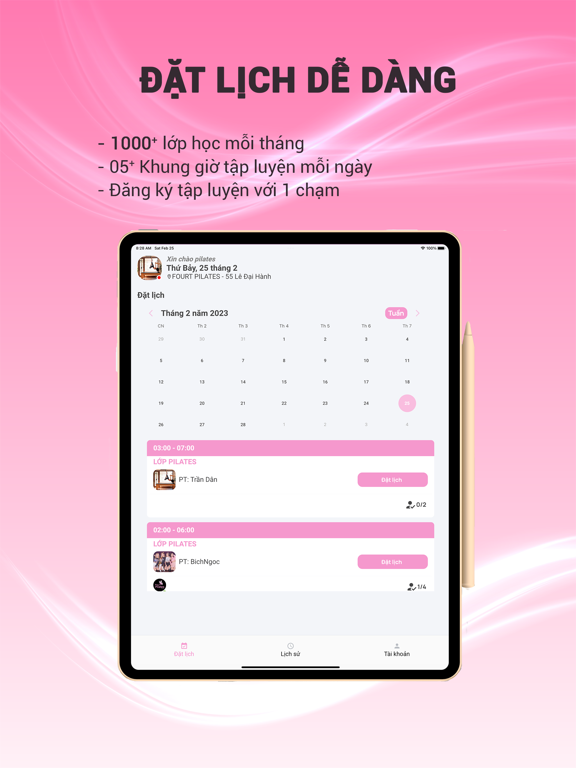
iPad screenshots



Icon palette
About this app
Pilates là một dạng bài tập chủ yếu tập trung vào việc củng cố phần cốt lõi. Bên cạnh sức mạnh cốt lõi, các bộ phận khác của cơ thể mà pilates giúp tăng cường sức mạnh là chân, đùi trên và mông. Các bài tập pilates toàn thân có tác dụng lên các nhóm cơ khác nhau, vùng lưng dưới, cơ bụng, cơ hông và vùng chậu. Cũng giống như yoga, pilates cũng có nhiều lợi ích. Pilates mang lại cho bạn năng lượng, sự cân bằng và linh hoạt, kéo căng và tăng cường cơ bắp, giúp bạn giảm cân, giữ dáng, cải thiện sức khỏe pilates cũng giúp bạn thư giãn, thậm chí ngủ ngon hơn. Tư thế sai có thể gây đau lưng, đau cổ và các vấn đề về cơ khác. Pilates có thể giúp tăng cường các cơ đó và thoát khỏi tư thế xấu. Pilates cũng giúp cải thiện tính linh hoạt. Với pilate, bạn sẽ gầy hơn và linh hoạt hơn. Tính linh hoạt tốt hơn có thể ngăn ngừa mọi nguy cơ chấn thương. Mọi người đều có thể tập pilate. Ứng dụng tập luy…
App details
What you can learn from FourT Pilates
Every shipping app on the App Store has gone through the same decisions you're working through right now: which screenshot goes first, what caption sits over it, which device frame to show, what color the background should be. The 12 screenshots above are FourT Pilates's answers to those questions — they're public, they're real, and they made it through Apple's review.
What the numbers say: FourT Pilates runs a light set where the background shifts from screenshot to screenshot (first shot #FC7CB4) — each image has to stand on its own, so the captions carry more of the story. The accent colour we picked up, #9C6454, is the one to reuse for badges, arrows and highlighted words if you borrow this look. Hit Use this style to open the editor with these exact colours and drop your own screenshot in.
Notice the first screenshot in particular. It's the one users see in search results and on the product page, and it's where most apps spend their best caption and tightest design. Look at the proportion of background to phone, where the text sits, what one thing the image is trying to communicate.
Want to see how other Sports apps approach the same problem? Browse more Sports apps in the showcase.
Take what works into your own screenshots
Open LaunchShots and design your App Store & Google Play screenshots — pick a device frame, drop captions, ship in minutes. Free, in your browser.
Open the screenshot editor →Apps with a similar look
Closest background + accent colours among the listings we've analysed — useful when you want to see the same palette handled by a different team.