Chart position — tracked daily by LaunchShots
Screenshot changes — detected by LaunchShots
Screenshot style breakdown
Sampled from 6 of مبشرات - تفسير الرؤى و الاحلام's App Store screenshots — background, accent and theme, measured by LaunchShots (not something Apple publishes).
#CCDCF4 bg
#B3C1D6
#54341C accent
#111111 text
Reading the caption text from the screenshots in your browser…
Screenshots

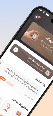


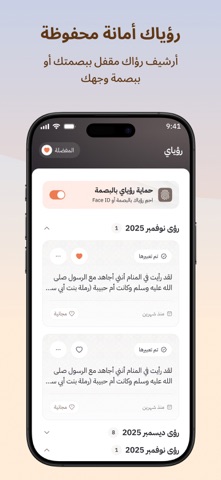

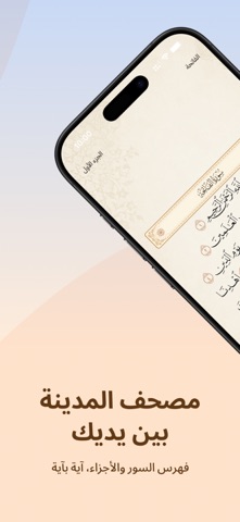


iPad screenshots


Icon palette
About this app
تطبيق الكتروني يضم نخبة منتقاة من المعبرين الملتزمين بمنهج أهل السنة والجماعة وسلف الأمة في تعبير الرؤى والأحلام وحسن توجيه الرائي وتبشيره أو تنبيهه لما فيه منفعته في دينه ودنياه وفق هدي نبينا محمد صلى الله عليه وسلم القائل لزوجته وحبيبته أم المؤمنين عائشة "رضي الله عنها " (مه يا عائشة إذا عبرتم للمسلم الرؤيا فاعبروها على خير فإن الرؤيا تكون على ما يعبرها صاحبها) حديث صحيح. مبتعدين بذلك عن التجاوزات والمخالفات الشرعية التي تنتشر اليوم وتضر بالرائي ضرراً بالغاً تفسد شؤونه وقد تتجاوز إلى الإضرار بمن حوله من زوج أو قريب أوصديق أو نحوه. ومن أمثلة التجاوزات والمخالفات المنتشرة اليوم ( الاستعانة بالجن ، عدم العلم بتعبير الرؤى والأحلام، ترويع الرائي، المبالغات والحشو الزائد الذي يشتت الرائي، التباهي في ادعاء معرفة التعبير والجزم بتحققه ، الخوض في خصوصيات لا تفيد في التعبير مع سوء الأدب وبشاعة الألفاظ مما ينفر الرائي.
App details
What you can learn from مبشرات - تفسير الرؤى و الاحلام
Every shipping app on the App Store has gone through the same decisions you're working through right now: which screenshot goes first, what caption sits over it, which device frame to show, what color the background should be. The 14 screenshots above are مبشرات - تفسير الرؤى و الاحلام's answers to those questions — they're public, they're real, and they made it through Apple's review.
What the numbers say: مبشرات - تفسير الرؤى و الاحلام runs a light set where the background shifts from screenshot to screenshot (first shot #CCDCF4) — each image has to stand on its own, so the captions carry more of the story. The accent colour we picked up, #54341C, is the one to reuse for badges, arrows and highlighted words if you borrow this look. Hit Use this style to open the editor with these exact colours and drop your own screenshot in.
Notice the first screenshot in particular. It's the one users see in search results and on the product page, and it's where most apps spend their best caption and tightest design. Look at the proportion of background to phone, where the text sits, what one thing the image is trying to communicate.
Want to see how other Lifestyle apps approach the same problem? Browse more Lifestyle apps in the showcase.
Take what works into your own screenshots
Open LaunchShots and design your App Store & Google Play screenshots — pick a device frame, drop captions, ship in minutes. Free, in your browser.
Open the screenshot editor →Apps with a similar look
Closest background + accent colours among the listings we've analysed — useful when you want to see the same palette handled by a different team.