Screenshot style breakdown
Sampled from 3 of Event Stars's App Store screenshots — background, accent and theme, measured by LaunchShots (not something Apple publishes).
#6C34F4 bg
#8050F5
#BC5CC4 accent
#FFFFFF text
Reading the caption text from the screenshots in your browser…
Screenshots

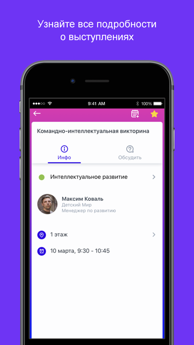

iPad screenshots


Icon palette
About this app
Event Stars — цифровая площадка мероприятий, программ и проектов для детей и молодежи. 6+ Участникам и гостям: - Легко ориентироваться в программе и на площадке - Просто быть в курсе всего интересного и важного - Удобно знакомиться и общаться с другими участниками - Эффективно учиться в формате мобильного обучения - Увлекательно участвовать в активностях и получать баллы Организаторам мероприятий и программ: - Простой способ сделать мероприятия мобильными и современными; - Вовлечение участников с помощью интерактивных возможностей; - 50+ подключаемых модулей функционала; - Обновление информации «на лету» и push-уведомления; - Опросы, тесты, викторины и формы обратной связи; - Интеграция прямых трансляций и онлайн-конференций; - Мобильное обучения и интеграция SCORM-курсов; - Отчеты об активности пользователей; - Безопасное хранение персональных данных в соответствие с законодательс…
App details
What you can learn from Event Stars
Every shipping app on the App Store has gone through the same decisions you're working through right now: which screenshot goes first, what caption sits over it, which device frame to show, what color the background should be. The 6 screenshots above are Event Stars's answers to those questions — they're public, they're real, and they made it through Apple's review.
What the numbers say: Event Stars runs a dark set with one background colour (#6C34F4) carried across every screenshot — the listing reads as a single poster when the shots sit side by side in search results. The accent colour we picked up, #BC5CC4, is the one to reuse for badges, arrows and highlighted words if you borrow this look. Hit Use this style to open the editor with these exact colours and drop your own screenshot in.
Notice the first screenshot in particular. It's the one users see in search results and on the product page, and it's where most apps spend their best caption and tightest design. Look at the proportion of background to phone, where the text sits, what one thing the image is trying to communicate.
Want to see how other Business apps approach the same problem? Browse more Business apps in the showcase.
Take what works into your own screenshots
Open LaunchShots and design your App Store & Google Play screenshots — pick a device frame, drop captions, ship in minutes. Free, in your browser.
Open the screenshot editor →Apps with a similar look
Closest background + accent colours among the listings we've analysed — useful when you want to see the same palette handled by a different team.