Screenshot style breakdown
Sampled from 4 of Kiti Live - A Stage to Shine's App Store screenshots — background, accent and theme, measured by LaunchShots (not something Apple publishes).
#641CF4 bg
#793BF5
#C474EC accent
#FFFFFF text
Screenshots
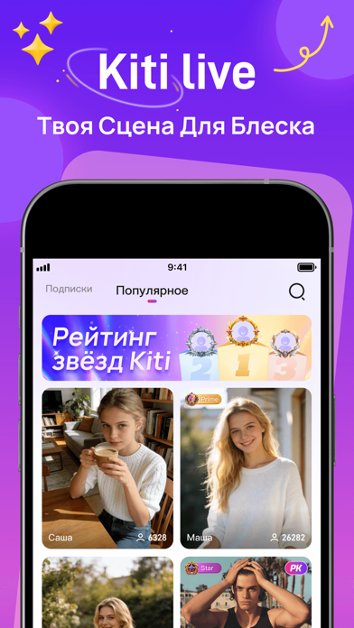
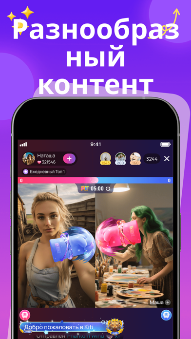
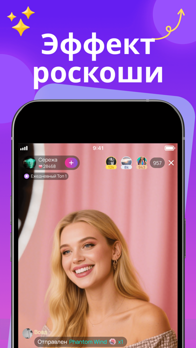
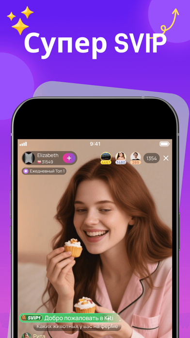
Icon palette
About this app
Kiti - Твоя сцена для блеска Добро пожаловать в Kiti, захватывающую платформу, где вы можете раскрыть свои таланты, выразить свои мнения и взаимодействовать с сообществом, которое ценит вашу уникальность. В обширном мире Kiti вы не просто еще одно лицо в толпе; вы звезда, готовая осветить онлайн-вселенную своим присутствием. Kiti - это больше, чем приложение; это сцена, где каждое взаимодействие - это возможность продемонстрировать свою индивидуальность. Делитесь историями, обменивайтесь идеями и позвольте вашей личности резонировать с аудиторией, готовой воспринять разнообразие взглядов. Независимо от того, мыслитель вы, мечтатель или артист, Kiti предоставляет вам прожектор, чтобы общаться искренне и творчески. Чувствуете себя немного застенчивым? Наши интерактивные функции делают это проще. Протяните руку с продуманным жестом, и вы увидите, как одно маленькое действие прокладывает…
App details
What you can learn from Kiti Live - A Stage to Shine
Every shipping app on the App Store has gone through the same decisions you're working through right now: which screenshot goes first, what caption sits over it, which device frame to show, what color the background should be. The 4 screenshots above are Kiti Live - A Stage to Shine's answers to those questions — they're public, they're real, and they made it through Apple's review.
What the numbers say: Kiti Live - A Stage to Shine runs a dark set with one background colour (#641CF4) carried across every screenshot — the listing reads as a single poster when the shots sit side by side in search results. The accent colour we picked up, #C474EC, is the one to reuse for badges, arrows and highlighted words if you borrow this look. Hit Use this style to open the editor with these exact colours and drop your own screenshot in.
Notice the first screenshot in particular. It's the one users see in search results and on the product page, and it's where most apps spend their best caption and tightest design. Look at the proportion of background to phone, where the text sits, what one thing the image is trying to communicate.
Want to see how other Social Networking apps approach the same problem? Browse more Social Networking apps in the showcase.
Take what works into your own screenshots
Open LaunchShots and design your App Store & Google Play screenshots — pick a device frame, drop captions, ship in minutes. Free, in your browser.
Open the screenshot editor →Apps with a similar look
Closest background + accent colours among the listings we've analysed — useful when you want to see the same palette handled by a different team.