Chart position — tracked daily by LaunchShots
Screenshot style breakdown
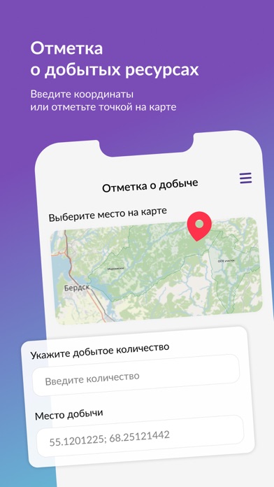
Sampled from 6 of Моя охота's App Store screenshots — background, accent and theme, measured by LaunchShots (not something Apple publishes).
#7C54C4 bg
#8E6BCC
#B494EC accent
#FFFFFF text
Screenshots




Icon palette
About this app
Мобильное приложение для охотников Новосибирской области, получивших электронное разрешение на добычу охотничьих ресурсов на территории общедоступных охотничьих угодий. Позволяет фиксировать информацию о добыче водоплавающей птицы в соответствии с установленным на территории Новосибирской области экспериментальным правовым режимом. Пользователям доступны следующие функции: - просмотр информации о своём охотничьем билете; - просмотр информации о полученном электронном разрешении на охоту; - просмотр информации об имеющихся административных правонарушениях; - фиксация добычи охотничьих ресурсов; - передача информации о всех добытых охотничьих ресурсах в рамках электронного разрешения. Работает без подключения к сети интернет. При получении электронного разрешения исключена необходимость повторного посещения министерства природных ресурсов и экологии Новосибирской области. С более под…
App details
What you can learn from Моя охота
Every shipping app on the App Store has gone through the same decisions you're working through right now: which screenshot goes first, what caption sits over it, which device frame to show, what color the background should be. The 6 screenshots above are Моя охота's answers to those questions — they're public, they're real, and they made it through Apple's review.
What the numbers say: Моя охота runs a mixed light-and-dark set where the background shifts from screenshot to screenshot (first shot #7C54C4) — each image has to stand on its own, so the captions carry more of the story. The accent colour we picked up, #B494EC, is the one to reuse for badges, arrows and highlighted words if you borrow this look. Hit Use this style to open the editor with these exact colours and drop your own screenshot in.
Notice the first screenshot in particular. It's the one users see in search results and on the product page, and it's where most apps spend their best caption and tightest design. Look at the proportion of background to phone, where the text sits, what one thing the image is trying to communicate.
Want to see how other Sports apps approach the same problem? Browse more Sports apps in the showcase.
Take what works into your own screenshots
Open LaunchShots and design your App Store & Google Play screenshots — pick a device frame, drop captions, ship in minutes. Free, in your browser.
Open the screenshot editor →Apps with a similar look
Closest background + accent colours among the listings we've analysed — useful when you want to see the same palette handled by a different team.