Chart position — tracked daily by LaunchShots
Screenshot changes — detected by LaunchShots
Screenshot style breakdown
Sampled from 5 of Яндекс Смена: поиск подработки's App Store screenshots — background, accent and theme, measured by LaunchShots (not something Apple publishes).
#7C644C bg
#8E7965
#C45C04 accent
#FFFFFF text
Screenshots



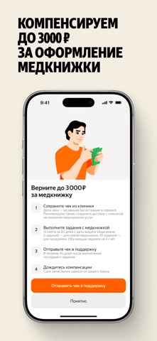
iPad screenshots


Icon palette
About this app
Яндекс Смена — приложение для поиска подработки в Москве и Московской области, Санкт-Петербурге и Ленинградской области и многих других регионах России с выплатой до 7 600 ₽ в день. Выбирайте смены рядом с домом, когда удобно, и получайте деньги быстро. Идеально, если нужен дополнительный доход, гибкий график или это первая работа без опыта. Почему Яндекс Смена: • Свободный график — берите смены тогда, когда удобно именно вам: утром, вечером или в выходные. • Задания рядом — находите подработку недалеко от дома или учёбы, чтобы не тратить время на дорогу. • Быстрая выплата — получайте деньги за отработанные смены без долгого ожидания. • Без опыта — большинство смен не требуют специальных навыков, всему научат на месте. • Понятные условия — заранее видите, сколько заплатят, где и что предстоит делать. Кому подходит: • Студентам, которые хотят совмещать учёбу и заработок. • Тем, кто ище…
App details
What you can learn from Яндекс Смена: поиск подработки
Every shipping app on the App Store has gone through the same decisions you're working through right now: which screenshot goes first, what caption sits over it, which device frame to show, what color the background should be. The 11 screenshots above are Яндекс Смена: поиск подработки's answers to those questions — they're public, they're real, and they made it through Apple's review.
What the numbers say: Яндекс Смена: поиск подработки runs a mixed light-and-dark set where the background shifts from screenshot to screenshot (first shot #7C644C) — each image has to stand on its own, so the captions carry more of the story. The accent colour we picked up, #C45C04, is the one to reuse for badges, arrows and highlighted words if you borrow this look. Hit Use this style to open the editor with these exact colours and drop your own screenshot in.
Notice the first screenshot in particular. It's the one users see in search results and on the product page, and it's where most apps spend their best caption and tightest design. Look at the proportion of background to phone, where the text sits, what one thing the image is trying to communicate.
Want to see how other Business apps approach the same problem? Browse more Business apps in the showcase.
Take what works into your own screenshots
Open LaunchShots and design your App Store & Google Play screenshots — pick a device frame, drop captions, ship in minutes. Free, in your browser.
Open the screenshot editor →Apps with a similar look
Closest background + accent colours among the listings we've analysed — useful when you want to see the same palette handled by a different team.