Screenshot style breakdown
Sampled from 4 of UpTv's App Store screenshots — background, accent and theme, measured by LaunchShots (not something Apple publishes).
#1C2C44 bg
#3B495E
#EC3C44 accent
#FFFFFF text
Reading the caption text from the screenshots in your browser…
Screenshots


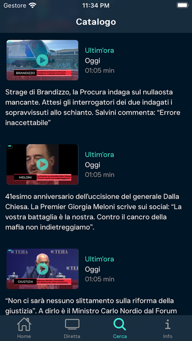

iPad screenshots


Icon palette
About this app
UpTv è la televisione presente da trent’anni nelle metropolitane e negli aeroporti italiani. Ideata, realizzata, curata e diffusa da Telesia Spa, azienda quotata alla Borsa di Milano e di proprietà del Gruppo Class Editori, UpTv crea e trasmette contenuti esclusivi, interamente prodotti in house. Già 10 milioni di spettatori ogni mese incontrano i suoi format originali in oltre 5mila schermi distribuiti sulle banchine di attesa delle metropolitane di Milano, Roma, Genova e Brescia, come nei gate di imbarco dei 15 principali aeroporti italiani. In più, UpTv si può vedere ovunque grazie a questa app. Informazione e intrattenimento pensati per il pubblico “fuoricasa” sono visibili in tutta Italia su smartphone, tablet e smart tv. Per essere sempre aggiornati e sapere cosa accade in Italia e nel Mondo con format rapidi, in real-time, facilmente ricercabili. Cosa troverai dentro l’ap…
App details
What you can learn from UpTv
Every shipping app on the App Store has gone through the same decisions you're working through right now: which screenshot goes first, what caption sits over it, which device frame to show, what color the background should be. The 8 screenshots above are UpTv's answers to those questions — they're public, they're real, and they made it through Apple's review.
What the numbers say: UpTv runs a dark set where the background shifts from screenshot to screenshot (first shot #1C2C44) — each image has to stand on its own, so the captions carry more of the story. The accent colour we picked up, #EC3C44, is the one to reuse for badges, arrows and highlighted words if you borrow this look. Hit Use this style to open the editor with these exact colours and drop your own screenshot in.
Notice the first screenshot in particular. It's the one users see in search results and on the product page, and it's where most apps spend their best caption and tightest design. Look at the proportion of background to phone, where the text sits, what one thing the image is trying to communicate.
Want to see how other News apps approach the same problem? Browse more News apps in the showcase.
Take what works into your own screenshots
Open LaunchShots and design your App Store & Google Play screenshots — pick a device frame, drop captions, ship in minutes. Free, in your browser.
Open the screenshot editor →Apps with a similar look
Closest background + accent colours among the listings we've analysed — useful when you want to see the same palette handled by a different team.