Screenshot style breakdown
Sampled from 6 of カーナビ COCCHi/Pioneerのカーナビ(かーなび)'s App Store screenshots — background, accent and theme, measured by LaunchShots (not something Apple publishes).
#040404 bg
#272727
#FC0464 accent
#FFFFFF text
Screenshots




Icon palette
About this app
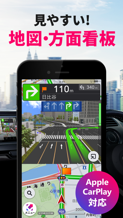
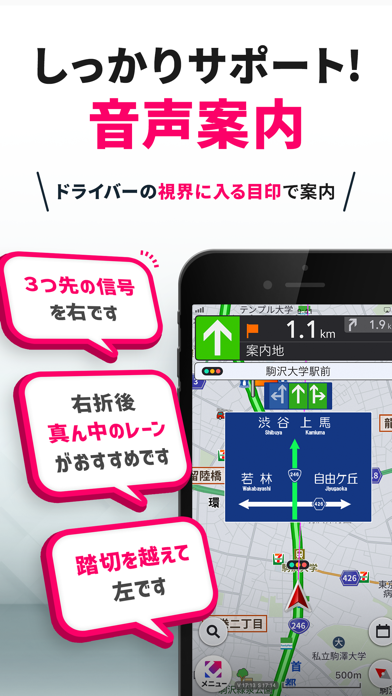
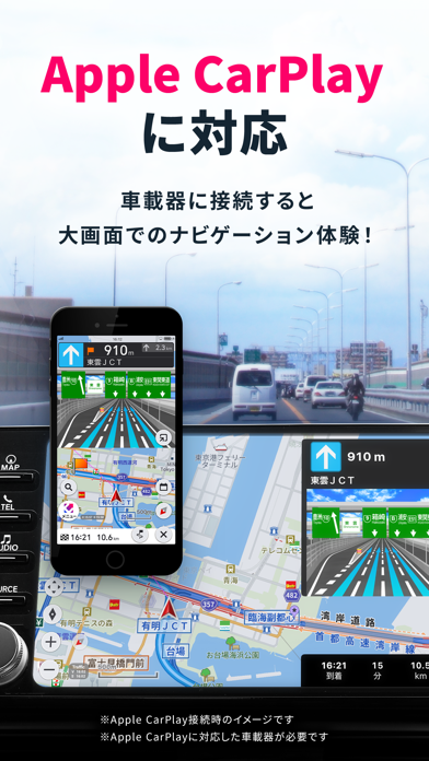
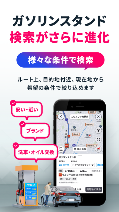
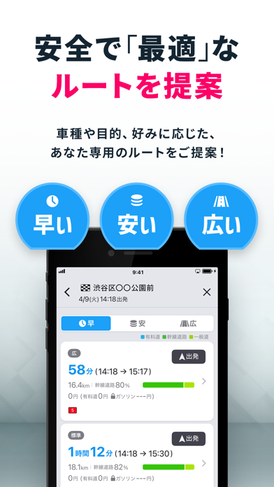
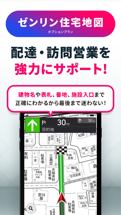
累計ダウンロード数150万突破!COCCHi(コッチ)は、スマホがあれば使える本格的なカーナビゲーションアプリです。 Pioneerの【カロッツェリアカーナビ】のノウハウを活かした最適なルート提案や丁寧な案内、ゼンリン住宅地図(オプション)、その他、充実したドライバーアシスト機能も搭載。 <COCCHiの特徴> ■ 最適なルート提案 ・パイオニア特許のカロッツェリアカーナビで培ったテクノロジー&蓄積データにより最適なルートを提案 ・狭い道路を避けた安全なルートや、最短距離のルート、高速道路料金やガソリン代を考慮したルートなどから、目的に合わせて選択可能 ・学習ルート探索機能により、あなたがよく使うルートを提案 ■ 丁寧なナビゲーション ・明確な音声ガイダンス&視認性の高いイラスト表示で、目的地まで分かりやすくナビゲーション ・ドライバーから見えている信号や踏切を目印にした案内の他、右左折後の推奨走行レーンなども具体的に案内 ・複雑な交差点や高速道路の分岐点など、まちがえやすい場所は、詳細なイラストマップと音…
App details
What you can learn from カーナビ COCCHi/Pioneerのカーナビ(かーなび)
Every shipping app on the App Store has gone through the same decisions you're working through right now: which screenshot goes first, what caption sits over it, which device frame to show, what color the background should be. The 10 screenshots above are カーナビ COCCHi/Pioneerのカーナビ(かーなび)'s answers to those questions — they're public, they're real, and they made it through Apple's review.
What the numbers say: カーナビ COCCHi/Pioneerのカーナビ(かーなび) runs a mixed light-and-dark set where the background shifts from screenshot to screenshot (first shot #040404) — each image has to stand on its own, so the captions carry more of the story. The accent colour we picked up, #FC0464, is the one to reuse for badges, arrows and highlighted words if you borrow this look. Hit Use this style to open the editor with these exact colours and drop your own screenshot in.
Notice the first screenshot in particular. It's the one users see in search results and on the product page, and it's where most apps spend their best caption and tightest design. Look at the proportion of background to phone, where the text sits, what one thing the image is trying to communicate.
Want to see how other Navigation apps approach the same problem? Browse more Navigation apps in the showcase.
Take what works into your own screenshots
Open LaunchShots and design your App Store & Google Play screenshots — pick a device frame, drop captions, ship in minutes. Free, in your browser.
Open the screenshot editor →Apps with a similar look
Closest background + accent colours among the listings we've analysed — useful when you want to see the same palette handled by a different team.