Chart position — tracked daily by LaunchShots
Screenshot style breakdown
Sampled from 5 of 鸣潮's App Store screenshots — background, accent and theme, measured by LaunchShots (not something Apple publishes).
#FCFCFC bg
#DDDDDD
#7CACC4 accent
#111111 text
Screenshots


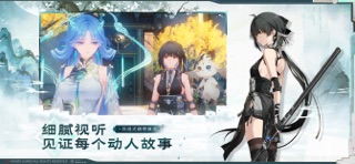

iPad screenshots


Icon palette
About this app
《鸣潮》是一款跨平台开放世界动作游戏,主打高自由度的动作战斗玩法与丰富多样的开放世界探索。而你,在这个世界苏醒的漂泊者,将在找回记忆、寻找自我身份的同时结识无数的共鸣者同伴,并和伙伴一起踏上改变这个世界的旅途。 ◆荣获The Game Awards2025玩家之声◆ ◆提名The Game Awards2025最佳移动游戏◆ ◆提名The Game Awards2024玩家之声◆ ◆提名The Game Awards2024最佳移动游戏◆ ◆游戏介绍◆ 漂泊的旅人,欢迎在这里醒来。 涨落无声,我们的世界刚刚经历一场退潮。 悲鸣降临,人类被旧日的法则遗留,文明于滩涂搁浅。 但所有静默之后,是不遗余力的发声。 随毁灭一同出现的异象,同样带来了新生,人类正与它们一起,开创全新纪元。 而你——漂泊者,你的旅途才刚刚开始。 或是邂逅并肩作战的伙伴,对峙无法想象的劲敌,或是吸纳改变自身的力量,揭露颠覆一切的真相,又或者,只是探索未曾目睹的奇观,尽可能延伸你能抵达的边界……我们无从知晓你将做出的选择,但我们期待你在灾厄余音中找到的答案。或许,你就是那个带领人类跨越滩涂的人。 潮声循环往复,文明再度启…
App details
What you can learn from 鸣潮
Every shipping app on the App Store has gone through the same decisions you're working through right now: which screenshot goes first, what caption sits over it, which device frame to show, what color the background should be. The 10 screenshots above are 鸣潮's answers to those questions — they're public, they're real, and they made it through Apple's review.
What the numbers say: 鸣潮 runs a light set with one background colour (#FCFCFC) carried across every screenshot — the listing reads as a single poster when the shots sit side by side in search results. The accent colour we picked up, #7CACC4, is the one to reuse for badges, arrows and highlighted words if you borrow this look. Hit Use this style to open the editor with these exact colours and drop your own screenshot in.
Notice the first screenshot in particular. It's the one users see in search results and on the product page, and it's where most apps spend their best caption and tightest design. Look at the proportion of background to phone, where the text sits, what one thing the image is trying to communicate.
Want to see how other Games apps approach the same problem? Browse more Games apps in the showcase.
Take what works into your own screenshots
Open LaunchShots and design your App Store & Google Play screenshots — pick a device frame, drop captions, ship in minutes. Free, in your browser.
Open the screenshot editor →Apps with a similar look
Closest background + accent colours among the listings we've analysed — useful when you want to see the same palette handled by a different team.