Chart position — tracked daily by LaunchShots
Screenshot style breakdown
Sampled from 5 of 全能扫描pro-文档、证件扫描's App Store screenshots — background, accent and theme, measured by LaunchShots (not something Apple publishes).
#54FCDC bg
#49DDC1
#046CE4 accent
#111111 text
Screenshots
Icon palette
About this app
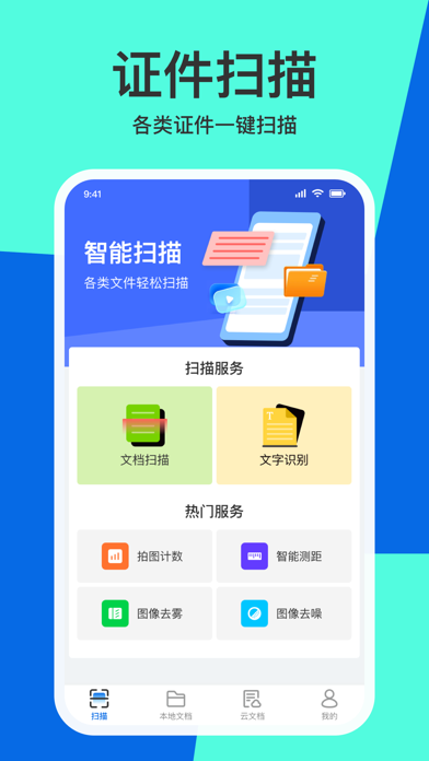
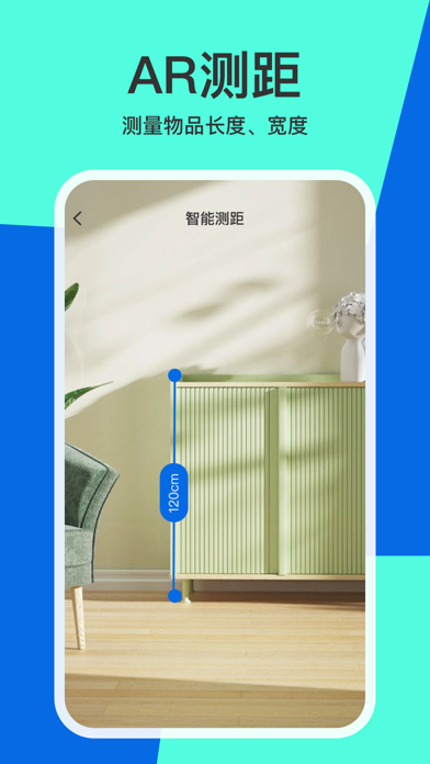
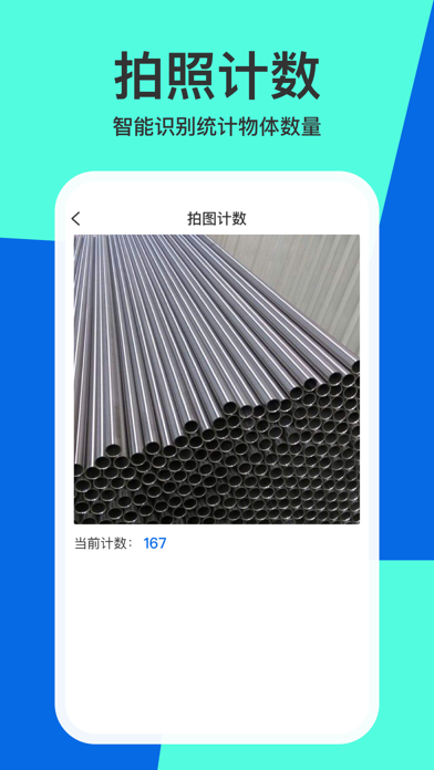
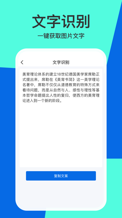
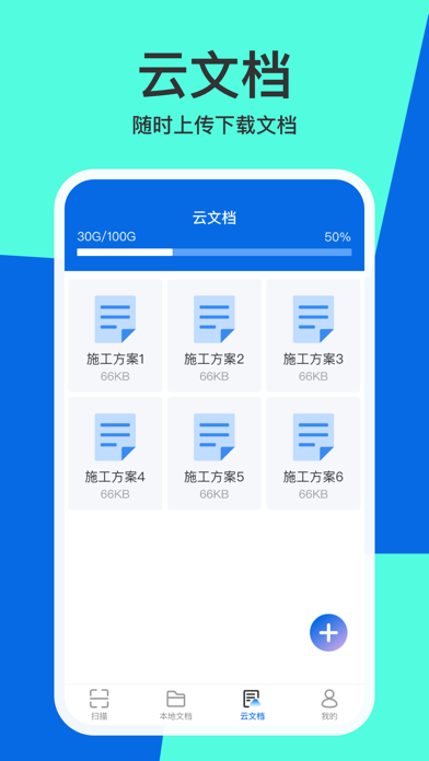
全能扫描pro是一款手机便携式扫描软件,此应用包含如下功能: 文档扫描:支持各类证件、文档扫描 文字识别:一键提取图片中的文字 拍图计数:统计图片中某个物品的数量 智能测距:测量空间中某个物体的长宽高 图片去雾:优化图片质量,去除图片中的雾气 图像去噪:优化图片质量,提高图片清晰度 云文档:云文件存储,可以随时上传下载 应用功能需要订阅后才可使用,订阅规则如下: 免费试用:新用户首次订阅可以享受3天免费试用,试用结束后将收取当前订阅的费用 自动续订:应用订阅采用自动订阅,若您无需订阅,请在订阅到期前至少24小时取消 用户协议:https://docs.qq.com/doc/p/e51db8e14d28b89e8c28a1e66559335fdb6c6128 隐私协议:https://docs.qq.com/doc/p/a8603fc7a75ccf30cb6d2697df985272be90a709
App details
What you can learn from 全能扫描pro-文档、证件扫描
Every shipping app on the App Store has gone through the same decisions you're working through right now: which screenshot goes first, what caption sits over it, which device frame to show, what color the background should be. The 5 screenshots above are 全能扫描pro-文档、证件扫描's answers to those questions — they're public, they're real, and they made it through Apple's review.
What the numbers say: 全能扫描pro-文档、证件扫描 runs a light set with one background colour (#54FCDC) carried across every screenshot — the listing reads as a single poster when the shots sit side by side in search results. The accent colour we picked up, #046CE4, is the one to reuse for badges, arrows and highlighted words if you borrow this look. Hit Use this style to open the editor with these exact colours and drop your own screenshot in.
Notice the first screenshot in particular. It's the one users see in search results and on the product page, and it's where most apps spend their best caption and tightest design. Look at the proportion of background to phone, where the text sits, what one thing the image is trying to communicate.
Want to see how other Utilities apps approach the same problem? Browse more Utilities apps in the showcase.
Take what works into your own screenshots
Open LaunchShots and design your App Store & Google Play screenshots — pick a device frame, drop captions, ship in minutes. Free, in your browser.
Open the screenshot editor →Apps with a similar look
Closest background + accent colours among the listings we've analysed — useful when you want to see the same palette handled by a different team.