Chart position — tracked daily by LaunchShots
Screenshot changes — detected by LaunchShots
Screenshot style breakdown
Sampled from 5 of FPHouse - Tìm Trọ Chính Chủ's App Store screenshots — background, accent and theme, measured by LaunchShots (not something Apple publishes).
#2C447C bg
#495E8E
#0C8CBC accent
#FFFFFF text
Screenshots
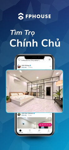

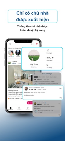
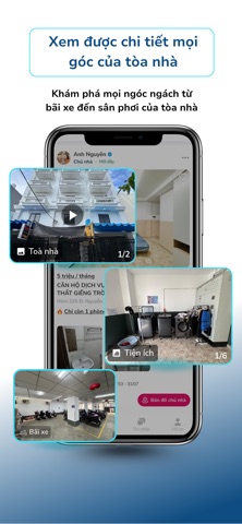

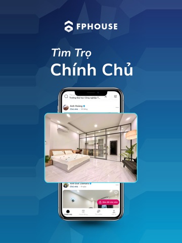
iPad screenshots



Icon palette
About this app
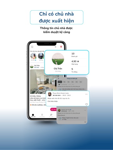
FPHOUSE – Ứng dụng thuê phòng chính chủ, minh bạch và an toàn nhất thị trường. FPHOUSE là nền tảng duy nhất trên thị trường chỉ làm việc trực tiếp với chủ nhà đã được kiểm duyệt chính chủ, mang đến trải nghiệm thuê phòng chân thực, minh bạch và an toàn tuyệt đối cho người thuê. Ứng dụng hiển thị đầy đủ hình ảnh, video thực tế của tòa nhà, bãi xe, khu giặt phơi – điều mà chưa nền tảng nào khác có. Người thuê có thể xem rõ ràng không gian thực tế trước khi đi xem phòng. Các tính năng nổi bật của FPHOUSE: Chỉ tin chính chủ: 100% tin đăng được xác thực và phê duyệt bởi đội ngũ FPHOUSE. Người dùng không thể tự đăng tin, đảm bảo không có tin giả, môi giới ẩn danh hay lừa đảo. Đánh giá thực tế từ người thuê: Sau khi đi xem phòng, người thuê có thể để lại đánh giá về căn phòng và chủ nhà, giúp người đến sau nhìn thấy thông tin minh bạch và đáng tin cậy. Tính năng đảm bảo cọc an toàn: Giúp…
App details
What you can learn from FPHouse - Tìm Trọ Chính Chủ
Every shipping app on the App Store has gone through the same decisions you're working through right now: which screenshot goes first, what caption sits over it, which device frame to show, what color the background should be. The 10 screenshots above are FPHouse - Tìm Trọ Chính Chủ's answers to those questions — they're public, they're real, and they made it through Apple's review.
What the numbers say: FPHouse - Tìm Trọ Chính Chủ runs a mixed light-and-dark set where the background shifts from screenshot to screenshot (first shot #2C447C) — each image has to stand on its own, so the captions carry more of the story. The accent colour we picked up, #0C8CBC, is the one to reuse for badges, arrows and highlighted words if you borrow this look. Hit Use this style to open the editor with these exact colours and drop your own screenshot in.
Notice the first screenshot in particular. It's the one users see in search results and on the product page, and it's where most apps spend their best caption and tightest design. Look at the proportion of background to phone, where the text sits, what one thing the image is trying to communicate.
Want to see how other Travel apps approach the same problem? Browse more Travel apps in the showcase.
Take what works into your own screenshots
Open LaunchShots and design your App Store & Google Play screenshots — pick a device frame, drop captions, ship in minutes. Free, in your browser.
Open the screenshot editor →Apps with a similar look
Closest background + accent colours among the listings we've analysed — useful when you want to see the same palette handled by a different team.