Chart position — tracked daily by LaunchShots
Screenshot style breakdown
Sampled from 6 of Anadolu Sağlık Merkezi's App Store screenshots — background, accent and theme, measured by LaunchShots (not something Apple publishes).
#1C4484 bg
#3B5E95
#1C84C4 accent
#FFFFFF text
- #1ANADOLU” n yeni haliyle
- #2ANADOLU JOHNS HOPKINS MEDICINE — İstediğiniz birim ve doktorumuza,
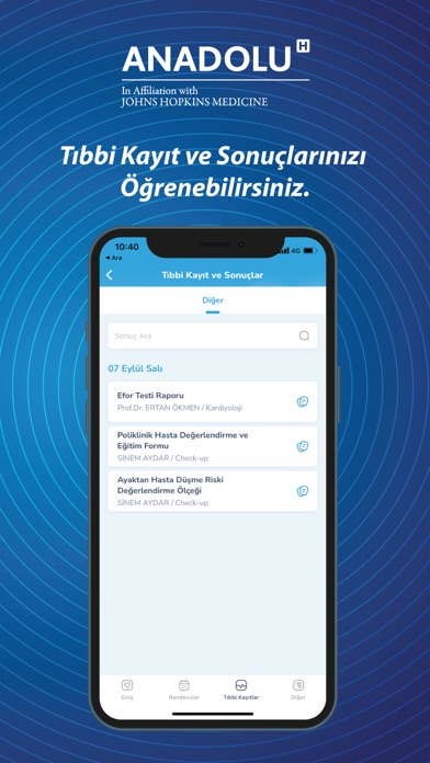
- #3ANADOLU bb K (ayit ve Sonuçlarınızı 77 Öğrenebilirsiniz.
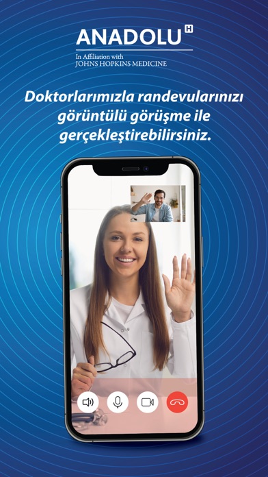
- #4ANADOLU” 7 örüntülü görüşme ile
- #5ANADOLU”
- #6ANADOLU”
Captions read from the screenshots (OCR, may contain small errors): 6 headlines, 4.7 words on average (longest 9).
Screenshots




Icon palette
About this app
Anadolu Sağlık Merkezi – Online Servisler Dünya standartlarında sağlık hizmeti sunmak hedefiyle kurulan Anadolu Sağlık Merkezi olarak 2002 yılından bu yana Johns Hopkins Medicine ile eğitim ve kalitenin geliştirilmesine yönelik stratejik iş birliği içinde çalışıp; Onkolojik Bilimler, Kalp Sağlığı, Kadın Sağlığı ve IVF, Nörolojik Bilimler, Cerrahi Bilimler, Dahili Bilimler, Tanı ve Görüntüleme başta olmak üzere tüm branşlarda hizmet sunuyoruz. iOS uygulamamız ile protokol numaranız, TC Kimlik Numaranız veya NFC teknolojisini destekleyen bir cihaza sahipseniz ve kimliğiniz yeni ise, kimliğinizi okutarak anında hesap oluşturabilir, istediğiniz Anadolu Sağlık Merkezi doktorlarından anında hastane randevusu alabilir, test sonuçlarınızı ve görüntüleme sonuç raporlarınızı sıra beklemeden, hastaneye gelmeden kolayca görüntüleyebilir, geçmiş muayene bilgilerinize mobil cihazınızdan da ulaşabi…
App details
What you can learn from Anadolu Sağlık Merkezi
Every shipping app on the App Store has gone through the same decisions you're working through right now: which screenshot goes first, what caption sits over it, which device frame to show, what color the background should be. The 6 screenshots above are Anadolu Sağlık Merkezi's answers to those questions — they're public, they're real, and they made it through Apple's review.
What the numbers say: Anadolu Sağlık Merkezi runs a mixed light-and-dark set where the background shifts from screenshot to screenshot (first shot #1C4484) — each image has to stand on its own, so the captions carry more of the story. The accent colour we picked up, #1C84C4, is the one to reuse for badges, arrows and highlighted words if you borrow this look. Hit Use this style to open the editor with these exact colours and drop your own screenshot in.
Notice the first screenshot in particular. It's the one users see in search results and on the product page, and it's where most apps spend their best caption and tightest design. Look at the proportion of background to phone, where the text sits, what one thing the image is trying to communicate.
Want to see how other Medical apps approach the same problem? Browse more Medical apps in the showcase.
Take what works into your own screenshots
Open LaunchShots and design your App Store & Google Play screenshots — pick a device frame, drop captions, ship in minutes. Free, in your browser.
Open the screenshot editor →Apps with a similar look
Closest background + accent colours among the listings we've analysed — useful when you want to see the same palette handled by a different team.