Chart position — tracked daily by LaunchShots
Screenshot style breakdown
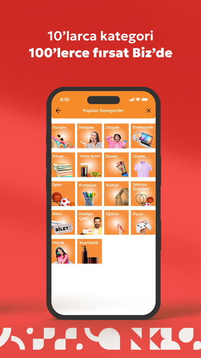
Sampled from 6 of Biz's App Store screenshots — background, accent and theme, measured by LaunchShots (not something Apple publishes).
#D42C24 bg
#DA4942
#94D40C accent
#FFFFFF text
Reading the caption text from the screenshots in your browser…
Screenshots
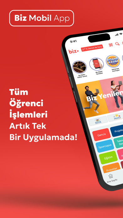


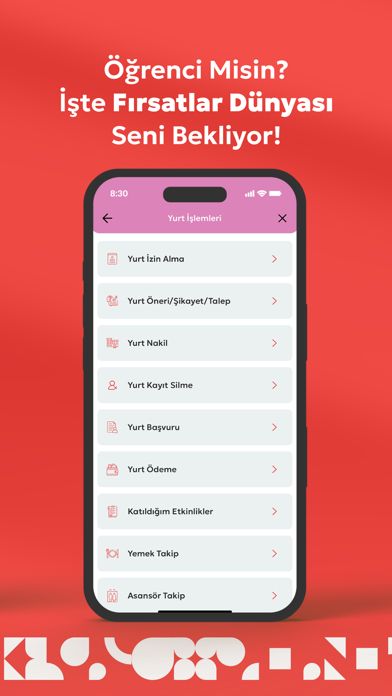
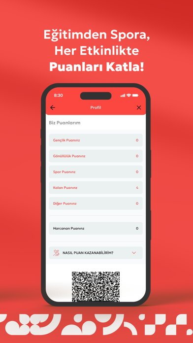
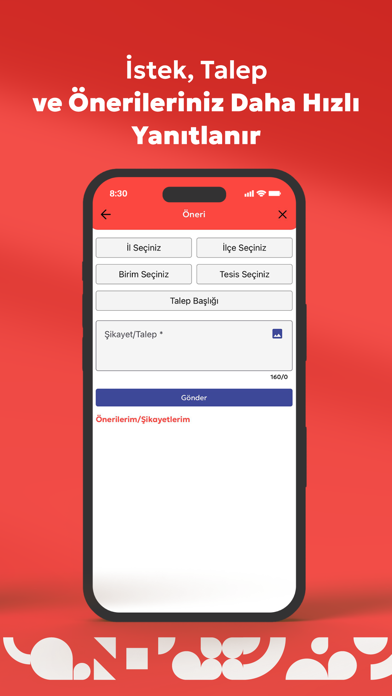

Icon palette
About this app
BİZ, Türkiye Cumhuriyeti Gençlik ve Spor Bakanlığı'nın desteğiyle, gençlerin kişisel, sosyal ve eğitimsel gelişimlerine katkı sağlamak amacıyla yenilikçi bir mobil uygulama olarak tasarlandı. Yurt işlemlerinden sosyal etkinliklere, spor faaliyetlerinden sanat ve kültür etkinliklerine kadar gençlerin her alandaki gelişimini desteklemek üzere baştan sona yenilendi. Yenilenen puan sistemi, öğrencilere geniş bir fırsat ve avantaj yelpazesi sunarak, onların gelişimine katkıda bulunuyor. Ayrıca, geliştirilmiş bildirim sistemimiz sayesinde öğrenciler, sunulan avantajlardan ve fırsatlardan anında haberdar olabilecekler. BİZ ile gençler, hayatlarını zenginleştirecek aktiviteleri keşfederken, aynı zamanda kariyer ve kişisel gelişim yollarında ilerleyebilecekler GSBBiz projesi sayesinde ‘Etkinlik Okuma’ özelliği sayesinde eğitmen öğrenci arasındaki etkinlik/eğitim/antrenman yoklama işle…
App details
What you can learn from Biz
Every shipping app on the App Store has gone through the same decisions you're working through right now: which screenshot goes first, what caption sits over it, which device frame to show, what color the background should be. The 8 screenshots above are Biz's answers to those questions — they're public, they're real, and they made it through Apple's review.
What the numbers say: Biz runs a dark set where the background shifts from screenshot to screenshot (first shot #D42C24) — each image has to stand on its own, so the captions carry more of the story. The accent colour we picked up, #94D40C, is the one to reuse for badges, arrows and highlighted words if you borrow this look. Hit Use this style to open the editor with these exact colours and drop your own screenshot in.
Notice the first screenshot in particular. It's the one users see in search results and on the product page, and it's where most apps spend their best caption and tightest design. Look at the proportion of background to phone, where the text sits, what one thing the image is trying to communicate.
Want to see how other Education apps approach the same problem? Browse more Education apps in the showcase.
Take what works into your own screenshots
Open LaunchShots and design your App Store & Google Play screenshots — pick a device frame, drop captions, ship in minutes. Free, in your browser.
Open the screenshot editor →Apps with a similar look
Closest background + accent colours among the listings we've analysed — useful when you want to see the same palette handled by a different team.