Chart position — tracked daily by LaunchShots
Screenshot style breakdown
Sampled from 6 of Domino Pizza - доставка пиццы's App Store screenshots — background, accent and theme, measured by LaunchShots (not something Apple publishes).
#FCFCFC bg
#DDDDDD
#34B4E4 accent
#111111 text
Screenshots


iPad screenshots
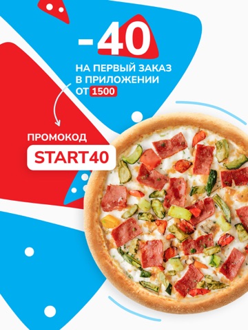

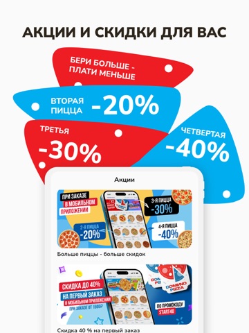

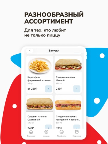

Icon palette
About this app
Мы — DOMINO PIZZA. Готовим и доставляем пиццу в Москве, Подмосковье, Санкт-Петербурге, Уфе,Челябинске, Ростове на Дону и Калининграде. Наш главный секрет — воздушное тесто с хрустящей корочкой и качественные продукты, которые мы отбираем с особым вниманием. В вашей пицце всегда будет тягучая моцарелла, насыщенный соус и щедрая начинка — все как вы любите. Мы рады, когда вы приходите в наши рестораны, но понимаем: иногда хочется просто заказать доставку. Она у нас бесплатная — достаточно оформить заказ на минимальную сумму. Скачивайте приложение и планируйте вечер с пиццей за пару кликов. Здесь можно: – копить баллы за заказы – отслеживать доставку – собирать пиццу из двух разных половинок – создавать комбо из любимых начинок – добавлять ингредиенты по вкусу – сохранять адреса и повторять заказы за секунду Быстрая доставка Мы готовим пиццу в ближайшем ресторане, поэтому она приедет …
App details
What you can learn from Domino Pizza - доставка пиццы
Every shipping app on the App Store has gone through the same decisions you're working through right now: which screenshot goes first, what caption sits over it, which device frame to show, what color the background should be. The 13 screenshots above are Domino Pizza - доставка пиццы's answers to those questions — they're public, they're real, and they made it through Apple's review.
What the numbers say: Domino Pizza - доставка пиццы runs a mixed light-and-dark set where the background shifts from screenshot to screenshot (first shot #FCFCFC) — each image has to stand on its own, so the captions carry more of the story. The accent colour we picked up, #34B4E4, is the one to reuse for badges, arrows and highlighted words if you borrow this look. Hit Use this style to open the editor with these exact colours and drop your own screenshot in.
Notice the first screenshot in particular. It's the one users see in search results and on the product page, and it's where most apps spend their best caption and tightest design. Look at the proportion of background to phone, where the text sits, what one thing the image is trying to communicate.
Want to see how other Food & Drink apps approach the same problem? Browse more Food & Drink apps in the showcase.
Take what works into your own screenshots
Open LaunchShots and design your App Store & Google Play screenshots — pick a device frame, drop captions, ship in minutes. Free, in your browser.
Open the screenshot editor →Apps with a similar look
Closest background + accent colours among the listings we've analysed — useful when you want to see the same palette handled by a different team.