Chart position — tracked daily by LaunchShots
Screenshot style breakdown
Sampled from 4 of e看牙-帮助口腔行业从业者工作更轻松's App Store screenshots — background, accent and theme, measured by LaunchShots (not something Apple publishes).
#FCFCFC bg
#DDDDDD
#34B4EC accent
#111111 text
Screenshots


iPad screenshots


Icon palette
About this app
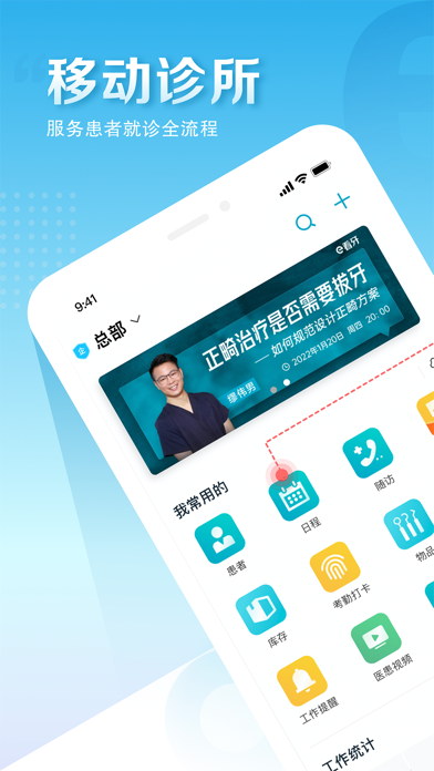
领健·e看牙,30万+口腔从业者专业工具和社区; e看牙app是一款为口腔医生量身打造的移动办公工具和社区应用。 作为医生的“移动诊室”,帮助医生完成预约及日程管理、患者管理、诊后随访、医患交流、病历维护等,支持与诊所前台、诊所老板、诊所其他医生等角色协作办公,移动端数据与领健e看牙管理系统PC端实时同步。 【社区】为医生提供了专业交流社区,陪伴口腔医生学习成长 【商城】领健商城,一站式牙科耗材器械采购平台 【日程管理】简洁好用的日程管理,工作安排一览无遗 【协作办公】同时支持诊所内其他角色使用,前台、老板、医生、洽谈师等多人协作 【多点执业】支持医生连锁诊所多点执业 【预约管理】随时查看预约安排,新建预约或变更后可收到提醒 【诊后随访】诊疗后对患者进行追踪、查访 【患者管理】轻松建立患者电子档案,方便管理与记忆 【电子病历】患者病历信息化,提升效率 【医患沟通】大量的医患沟通图文、视频科普素材,辅助医患沟通 【关于领健·e看牙 | 领健商城】 国内领先的口腔机构信息化服务提供商,领健信息致力于以信息技术改造口腔医疗…
App details
What you can learn from e看牙-帮助口腔行业从业者工作更轻松
Every shipping app on the App Store has gone through the same decisions you're working through right now: which screenshot goes first, what caption sits over it, which device frame to show, what color the background should be. The 7 screenshots above are e看牙-帮助口腔行业从业者工作更轻松's answers to those questions — they're public, they're real, and they made it through Apple's review.
What the numbers say: e看牙-帮助口腔行业从业者工作更轻松 runs a light set where the background shifts from screenshot to screenshot (first shot #FCFCFC) — each image has to stand on its own, so the captions carry more of the story. The accent colour we picked up, #34B4EC, is the one to reuse for badges, arrows and highlighted words if you borrow this look. Hit Use this style to open the editor with these exact colours and drop your own screenshot in.
Notice the first screenshot in particular. It's the one users see in search results and on the product page, and it's where most apps spend their best caption and tightest design. Look at the proportion of background to phone, where the text sits, what one thing the image is trying to communicate.
Want to see how other Medical apps approach the same problem? Browse more Medical apps in the showcase.
Take what works into your own screenshots
Open LaunchShots and design your App Store & Google Play screenshots — pick a device frame, drop captions, ship in minutes. Free, in your browser.
Open the screenshot editor →Apps with a similar look
Closest background + accent colours among the listings we've analysed — useful when you want to see the same palette handled by a different team.