Chart position — tracked daily by LaunchShots
Screenshot style breakdown
Sampled from 4 of CCMTV临床频道's App Store screenshots — background, accent and theme, measured by LaunchShots (not something Apple publishes).
#FCFCFC bg
#DDDDDD
#84DCFC accent
#111111 text
Screenshots
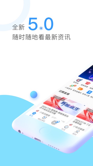
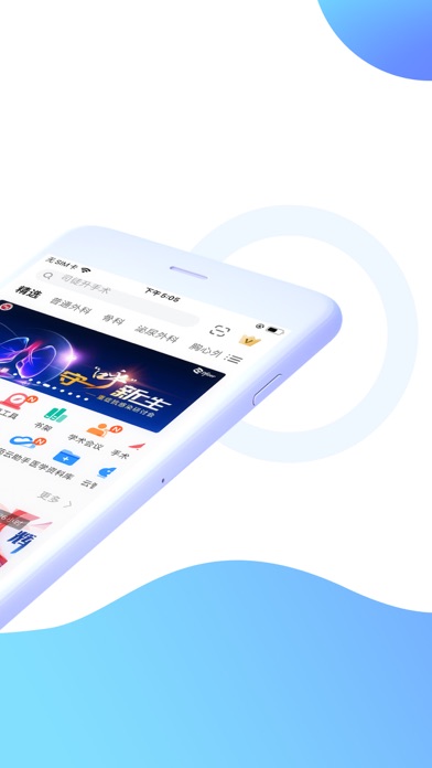
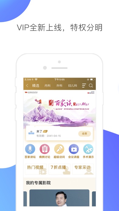
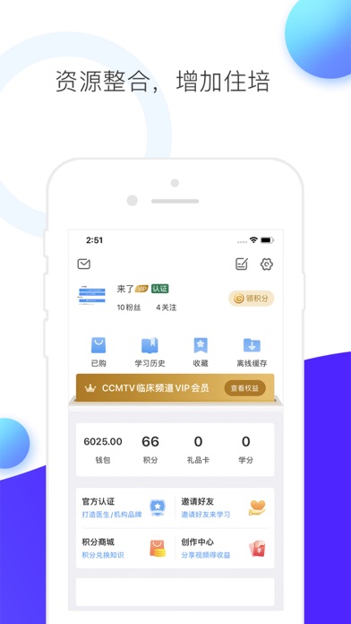
iPad screenshots


Icon palette
About this app
CCMTV临床频道,专注医疗健康领域,构建医教及诊疗数字化生态。 医疗领域专业用户,请登录「医护入口」。 名家荟萃、聚焦临床,贯穿医学教育全过程内容,涵盖病例讨论、临床经验、手术演示、考试晋升、指南用药、医学社区等,是医护工作者的学习、交流工具。 大众用户,请登录「大众入口」。 疾病早筛、规范化诊疗、院外健康管理等,围绕疾病诊疗全流程,聚焦院外健康场景,集合各领域专家共建的科普内容,提升大众自我健康管理意识。 ****************************** 【核心服务】 -「手术演示」:一线专家展示手术演示,提供疑难手术成功案例。 -「病例讨论」:知名专家展示经典治疗方案,推广规范化治疗理念。 -「 IP 打造」:个人入驻,开通账号,上传作品,分享观点,打造影响力。 -「医学社区」:病例交流、值夜班、求职招聘各类话题社区讨论。 -「医学会议」:直播与转播国内外前沿医学会议,及时深度报道。 -「名家视角」:有观点、有态度、有深度、有价值的访谈类节目。 -「指南工具」:收录权威机构发布的指南共识,支持检索、查看、下载。 -「医考晋升…
App details
What you can learn from CCMTV临床频道
Every shipping app on the App Store has gone through the same decisions you're working through right now: which screenshot goes first, what caption sits over it, which device frame to show, what color the background should be. The 7 screenshots above are CCMTV临床频道's answers to those questions — they're public, they're real, and they made it through Apple's review.
What the numbers say: CCMTV临床频道 runs a light set with one background colour (#FCFCFC) carried across every screenshot — the listing reads as a single poster when the shots sit side by side in search results. The accent colour we picked up, #84DCFC, is the one to reuse for badges, arrows and highlighted words if you borrow this look. Hit Use this style to open the editor with these exact colours and drop your own screenshot in.
Notice the first screenshot in particular. It's the one users see in search results and on the product page, and it's where most apps spend their best caption and tightest design. Look at the proportion of background to phone, where the text sits, what one thing the image is trying to communicate.
Want to see how other Medical apps approach the same problem? Browse more Medical apps in the showcase.
Take what works into your own screenshots
Open LaunchShots and design your App Store & Google Play screenshots — pick a device frame, drop captions, ship in minutes. Free, in your browser.
Open the screenshot editor →Apps with a similar look
Closest background + accent colours among the listings we've analysed — useful when you want to see the same palette handled by a different team.