Screenshot style breakdown
Sampled from 6 of Bootsschule1's App Store screenshots — background, accent and theme, measured by LaunchShots (not something Apple publishes).
#0424BC bg
#2742C5
#5C6C94 accent
#FFFFFF text
- #1Online zum
- #2Effiziente Priifungs- vorbereitung fiir
- #3Hochwertige Video- inhalte fir einen ganz- heitlichen Lerneffekt
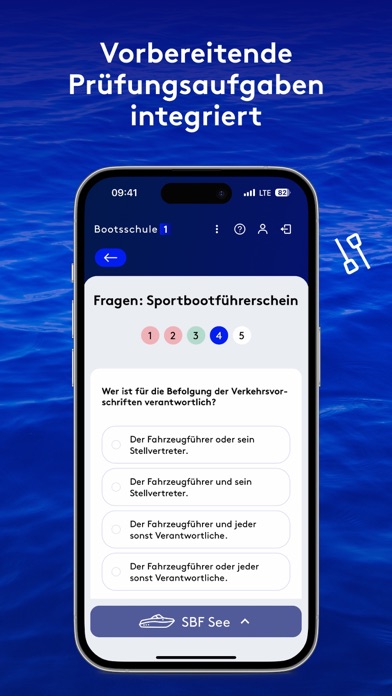
- #4Vorbereitende Priifungsaufgaben integriert
- #5Knoten lernen leicht gemacht
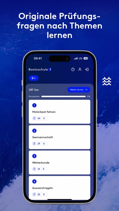
- #6Originale Prüfungs- fragen nach Themen lernen
Captions read from the screenshots (OCR, may contain small errors): 6 headlines, 4.5 words on average (longest 8).
Screenshots





iPad screenshots


Icon palette
About this app
Eine qualitative Ausbildung garantiert dir als Sportbootfahrer nicht nur die Sicherheit auf dem Wasser und damit den Spaß am Hobby, sondern sorgt für eindrucksvolle Erlebnisse: Das Meer, das Land, die Menschen, alles lässt sich auf eine eindrucksvolle Weise erleben. Faszinierende Naturschauspiele schenken Erlebnisse in kaum berührter Natur. Zusammen mit den besten Freunden einzigartige Momente erleben und Erinnerungen kreieren, die für immer bleiben. Jedem soll die Vorbereitung auf die maritimen Befähigungsnachweise online ohne zeitliche oder räumliche Hürden möglich sein. Durch das Lernen im eigenen Tempo bei freier Zeiteinteilung erzielst du das optimale Lernergebnis. In der immer enthaltenen Praxisausbildung in deiner Nähe wird die richtige und sichere Handhabung eines Bootes in der Praxis erlernt. Der schlussendliche Prüfungserfolg ist unsere höchste Priorität, daher begleiten wir …
App details
What you can learn from Bootsschule1
Every shipping app on the App Store has gone through the same decisions you're working through right now: which screenshot goes first, what caption sits over it, which device frame to show, what color the background should be. The 18 screenshots above are Bootsschule1's answers to those questions — they're public, they're real, and they made it through Apple's review.
What the numbers say: Bootsschule1 runs a dark set where the background shifts from screenshot to screenshot (first shot #0424BC) — each image has to stand on its own, so the captions carry more of the story. The accent colour we picked up, #5C6C94, is the one to reuse for badges, arrows and highlighted words if you borrow this look. Hit Use this style to open the editor with these exact colours and drop your own screenshot in.
Notice the first screenshot in particular. It's the one users see in search results and on the product page, and it's where most apps spend their best caption and tightest design. Look at the proportion of background to phone, where the text sits, what one thing the image is trying to communicate.
Want to see how other Education apps approach the same problem? Browse more Education apps in the showcase.
Take what works into your own screenshots
Open LaunchShots and design your App Store & Google Play screenshots — pick a device frame, drop captions, ship in minutes. Free, in your browser.
Open the screenshot editor →Apps with a similar look
Closest background + accent colours among the listings we've analysed — useful when you want to see the same palette handled by a different team.