Chart position — tracked daily by LaunchShots
Screenshot style breakdown
Sampled from 6 of 知聊-一对一视频聊天's App Store screenshots — background, accent and theme, measured by LaunchShots (not something Apple publishes).
#FCD4EC bg
#DDBACF
#CC9C84 accent
#111111 text
Screenshots


Icon palette
About this app
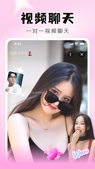
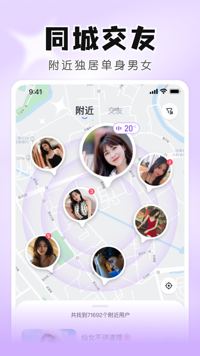
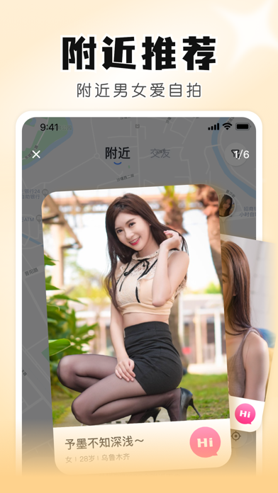
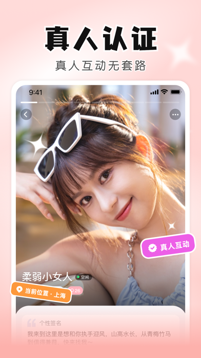
附近真人一对一视频聊天软件 深夜加班后想打视频?周末一个人不知道干什么? 知聊,专注附近一对一视频聊天的同城交友软件。每条消息都有人秒回,每次倾诉都有回应,告别“已读不回”的失落感。 你可能正在经历: ▸ 加班到深夜,回到家空荡荡,想找人打视频说说话 ▸ 周末宅在家不知道干什么,或节假日一个人不想刷短视频 ▸ 刚搬到新城市谁也不认识,或出差晚上在酒店不知道找谁 ▸ 深夜翻来覆去睡不着,或心情不好想找个人视频聊聊天 ▸ 周末约不到人,想找搭子一起看电影、吃饭、徒步 ▸ 想打游戏找不到队友,或下班后想找人说说话放松一下 不管你是哪一种,知聊都能帮你快速匹配在线聊得来的真人,不冷场,聊得起来。 【核心功能】 同城智能匹配,遇见附近的人 基于实时位置推荐身边的同城用户,拒绝无效等待,在线即聊,让陪伴触手可及。 真人视频认证,拒绝照骗 人脸识别+身份核验双重认证。没有机器人,没有假头像,每一次视频都是真实的相遇。 先文字后视频,避免尴尬 双方文字聊得来后再发起视频通话,尊重你的节奏,让社交更自然。 按兴趣找同好,不尬聊…
App details
What you can learn from 知聊-一对一视频聊天
Every shipping app on the App Store has gone through the same decisions you're working through right now: which screenshot goes first, what caption sits over it, which device frame to show, what color the background should be. The 6 screenshots above are 知聊-一对一视频聊天's answers to those questions — they're public, they're real, and they made it through Apple's review.
What the numbers say: 知聊-一对一视频聊天 runs a light set where the background shifts from screenshot to screenshot (first shot #FCD4EC) — each image has to stand on its own, so the captions carry more of the story. The accent colour we picked up, #CC9C84, is the one to reuse for badges, arrows and highlighted words if you borrow this look. Hit Use this style to open the editor with these exact colours and drop your own screenshot in.
Notice the first screenshot in particular. It's the one users see in search results and on the product page, and it's where most apps spend their best caption and tightest design. Look at the proportion of background to phone, where the text sits, what one thing the image is trying to communicate.
Want to see how other Social Networking apps approach the same problem? Browse more Social Networking apps in the showcase.
Take what works into your own screenshots
Open LaunchShots and design your App Store & Google Play screenshots — pick a device frame, drop captions, ship in minutes. Free, in your browser.
Open the screenshot editor →Apps with a similar look
Closest background + accent colours among the listings we've analysed — useful when you want to see the same palette handled by a different team.