Screenshot style breakdown
Sampled from 6 of Стройландия - товары для дома's App Store screenshots — background, accent and theme, measured by LaunchShots (not something Apple publishes).
#1494F4 bg
#34A2F5
#FCDC24 accent
#FFFFFF text
Screenshots
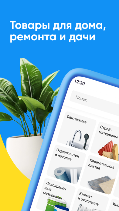
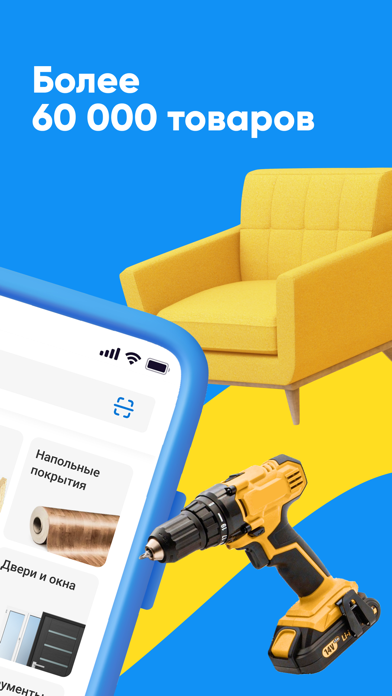
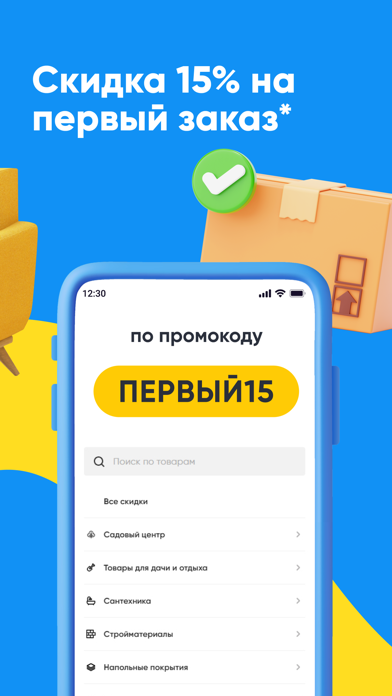


Icon palette
About this app
Заходите в приложение Стройландия! Покупайте все для дома, дачи и ремонта в одном из крупнейших строительных магазинов. ДЕЛАЙТЕ ПОКУПКИ БЫСТРО И ЛЕГКО — Ищите товары по умному поиску и фильтру по брендам. — Добавляйте нужные позиции в корзину сразу из каталога. — Оформляйте доставку в более чем 30 городах России, в том числе с возможностью доставки в день заказа. — Получайте консультации и ответы на все вопросы прямо в приложении. ЭКОНОМЬТЕ С АКЦИЯМИ — Следите за новыми акционными предложениями и сезонными распродажами. — Бронируйте товары по выгодной цене и забирайте в удобное время. ПОЛУЧАЙТЕ СКИДКУ ПРИ РЕГИСТРАЦИИ — Зарегистрируйтесь в несколько кликов. — Оформите «Клубную карту» прямо в приложении. — Получите скидку 15% на первый заказ по промокоду ПЕРВЫЙ15 (кроме категорий «Низкая цена» и «Фиксированная цена»). ПЛАНИРУЙТЕ РЕМОНТ — Составляйте смету заранее, выбирая материалы и …
App details
What you can learn from Стройландия - товары для дома
Every shipping app on the App Store has gone through the same decisions you're working through right now: which screenshot goes first, what caption sits over it, which device frame to show, what color the background should be. The 6 screenshots above are Стройландия - товары для дома's answers to those questions — they're public, they're real, and they made it through Apple's review.
What the numbers say: Стройландия - товары для дома runs a dark set with one background colour (#1494F4) carried across every screenshot — the listing reads as a single poster when the shots sit side by side in search results. The accent colour we picked up, #FCDC24, is the one to reuse for badges, arrows and highlighted words if you borrow this look. Hit Use this style to open the editor with these exact colours and drop your own screenshot in.
Notice the first screenshot in particular. It's the one users see in search results and on the product page, and it's where most apps spend their best caption and tightest design. Look at the proportion of background to phone, where the text sits, what one thing the image is trying to communicate.
Want to see how other Shopping apps approach the same problem? Browse more Shopping apps in the showcase.
Take what works into your own screenshots
Open LaunchShots and design your App Store & Google Play screenshots — pick a device frame, drop captions, ship in minutes. Free, in your browser.
Open the screenshot editor →Apps with a similar look
Closest background + accent colours among the listings we've analysed — useful when you want to see the same palette handled by a different team.